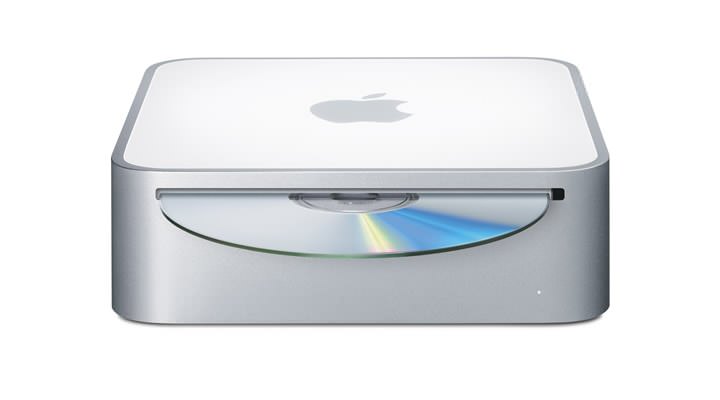
The new Mac mini is just what the company has needed to have been selling for a long time, too long in fact. With this product (aimed squarely at the PC buying consumer) alongside the continued success of the iPod, Apple is slowly becoming a mass consumer brand.
The Mac mini is beautiful as you’d expect, and acts as a great introduction to the world of Macintosh. Although it would seem that welcome isn’t too warm – I can’t help feeling that not including a keyboard and mouse is a little bit on the tight side. It’s no secret that Apple is aiming this sub-�400 product at the iPod user, impressed with the iPods design and ease of use and perhaps looking to move to Mac. They now have a viable upgrade path, and can keep hold of their monitor and other existing peripherals, yet I’m sure many of these potential customers will have systems that don’t use USB keyboards and mice and will have to purchase (perhaps budget) peripherals, thus diminishing the experience.
Then you go and spoil it all…
However, what has really annoyed me, is Apple’s continued user interface design ‘tweaks’ that for the benefit of this post, we will refer to as cock ups.
There is no doubt in my mind that Apple’s product design is second to none – their hardware simply rocks – both in looks and functionality. But even Apple can’t be perfect and every now and again a design blunder is added into the mix. These almost exclusively occur within the realm of application interface design.
The most notable of these was the introduction of a ‘brushed metal’ theme, first seen in QuickTime 4, before soon spreading like an uncontrollable disease to iTunes, iMovie, iPhoto etc., without any plausible reason for doing so. Many of the inconsistencies that initially appeared even within this theme have since been ironed out over the years, and I have come to except this as a way of distinguishing between productivity software and lifestyle apps/utilities.
But with the latest demo of the forthcoming Mac OS X 10.4 ‘Tiger’, it seems things really have gone to pot. ‘Mail’ the e-mail client bundled with the OS, currently sports a completely bizarre and out of place toolbar design, and the same can be said for other parts of the applications design.
Proudly displaying it’s nonconformist grey-aqua-ish buttons that contain smaller squashed icons within, it almost looks as the design team was on strike that day. With 10.4 still in pre-release, I can only hope such bad design will not be allowed outside the doors of Cupertino.