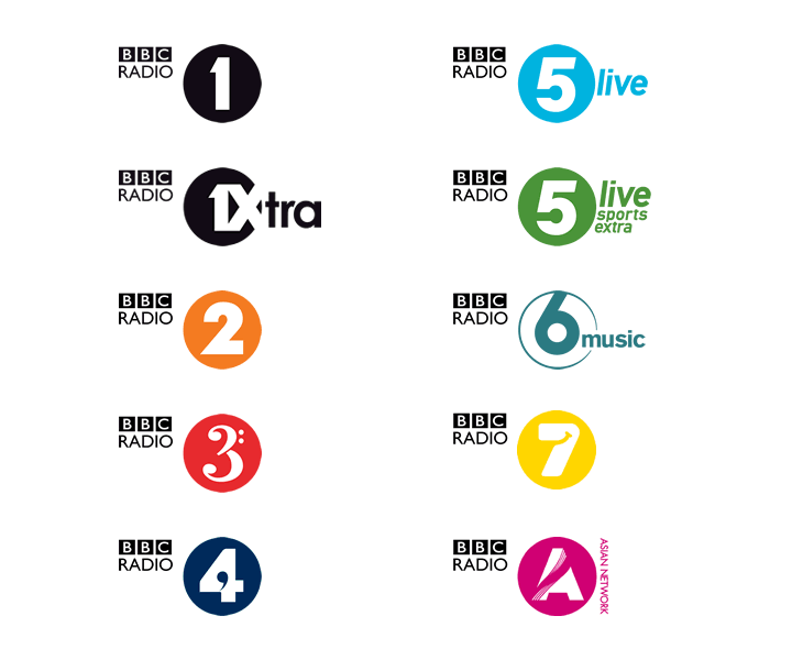
This last month has seen the gradual introduction of a new set of station identities for BBC Radio, designed by Fallon, In this overarching re-brand, each of the BBC’s national radio stations have been given an identity that falls within an overall templated design.
Lets go back ten years. In 1997, the corporations re-brand put a stake in the ground. Every single logo within the organisation was brought into line by placing each department, division and station name over a unique background.
Whilst in some instances this resulted in bland identities, cross media promotion and marketing worked incredibly well. It was only natural of course, that over time each brand would want to break out of this straight jacket, and the corporations radio stations were the first to do so. In 2000, each station got a more sophisticated logo that was better able to reflect its output.
Whilst it’s great to see consistency brought back across the radio services (if only in terms of naming – the mixture of ‘BBC7’, ‘6 Music’, and ‘Five Live’ always annoyed me), it’s a shame also that these logos have been replaced with a somewhat half-baked design.
Like fellow Multipacker Andy Higgs, who has also written his thoughts on the new identities, I will provide my thoughts on each logo separately below. Whilst they work nicely as a set (oooh, colours!), lets not forget that they need to work individually too.
Radio 1
If you want to see how your licence fee gets spent, watch how every outside broadcasting truck, station furniture, website, etc gets replaced with this ‘new’ logo, whilst the only difference is the addition of a serif ascender to the once clean and simple logo. The change is so subtle to ask why make the change at all?
Well, part of the change is also the positioning of the BBC Radio logo, which is smaller than before – and scales pretty poorly as a result.
1 Xtra
Much like the Radio 1 logo, this is just a small update to what went before, all be it bringing it far closer to the design of it’s sister station. The designers talk of how there is now a play symbol created between the 1 and the X. However, this is no FedEx logo (with it’s clever subliminal arrow). In fact I’m pretty sure they noticed the play symbol after they designed it.
Radio 2
The previous logo was actually clever visual gag for those in the know. As Radio 2 was born out of the Light Programme, so the 2 was created from 4 differently coloured neon lights. This was a great hook into the stations heritage, as well as provide a hint to the stations programming (variety). This logo could also be animated on TV trails.
It’s replacement which is designed to ‘catch up to where Radio 2 is now’ provides no clue as to the stations content or personality, and whilst supporting graphics and imagery can help here, it’s the logo that will be seen most often. This is a really poor excuse for an identity.
Radio 3 and Radio 4
Perhaps the two strongest identities of the set, if not overly simplified. I will be very upset to see the departure of the existing Radio 3 logo though, which was just beautiful.
Radio 5 Live
This was the first of the new logos I spotted, having seen it on the podcast artwork for Mark Kermode’s film reviews. I honestly thought it was a mistake.
Much like the Radio 2 logo, this identity lacks personality, except for perhaps looking incredibly dated. I also can’t help feel that the 5 numeral should match the italicisation of the ‘live’ text.
We are told the associated logo for Sports Extra is green because that is associated with sport. Very imaginative.
6 Music
Designed to mimic the shape of a vinyl disc, or the ipod click wheel, this is yet another design that lacks polish with the centre of the 6 not being at the centre of the circle, meaning this visual hook is lost. Note also how it doesn’t follow the style of the other logos.
BBC 7
This design essentially brings an element of the previous logo into the new template, which I guess works to a certain degree.
Asian Network
Probably the best logo of the set. Stylish, modern, and reflective of the station, if not a little awkward having to use the first letter of this stations name as it has no number. I can’t help but think that the designer spent 90% of his time on this project designing this one logo, and then rushed the rest in the remaining 10%.
I will of course give these some time to settle in, and see how they are applied to the web-sites and such, but for me, this is yet another botched branding attempt from Auntie. Compare these new logos to their predecessors, and they seem incredibly flat and lifeless having lost all the dynamism they once had.
Alongside other recent identity updates at the Beeb, and the increasingly fractured nature of the BBC’s brand, this latest effort confirms for me that the BBC is no longer the bastion of great design in the broadcasting industry it once was. At a time when all of the BBC’s creative departments have been privatised, is it any wonder.