On flicking through the newspaper on the train home yesterday, I spotted an advertisement for Network Rail, the semi-nationalised body responsible for much of Britain’s rail infrastructure.
I had been vaguely aware of their recent marketing campaigns where the logo slots into the top right corner of a distinctive trapezium containing shape. However on seeing this particular advertisement close up, I did a quick double take, spotting what seemed to be an updated logo. A quick search on Google images confirmed my suspicion.
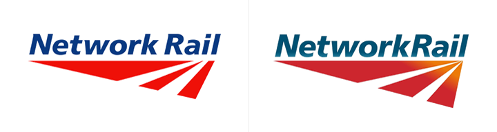
Network Rail: The original logo (2002) and the updated version (2009).
To me the previous logo always had a temporary feel to it. Network Rail was created out of the ashes of Railtrack, a privatised company that owned the nations railways prior to it being placed into ‘railway administration’ by the government in 2002. At the time I remember thinking the logo for this new body must have been quickly thrown together by a low ranking designer at the Department of Transport, such was its low fidelity.
Seven years later, and with a massive investment programme underway, it would seem that Network Rail has finally decided to give its logo a subtle update.
Many of the changes are small, but they all add up to create a tighter, more manageable mark. Tighter kerning and the removal of the space between the two words has allowed the overall logo to be reduced in width by around 10%. The typeface has also been altered sightly, removing the serifs that were barely noticeable before.
The distinctive red triangle also moves closer to the text, and the two cut outs that suggest a track disappearing into the distance now converge on a single point rather than the unknown destination seen previously. The colour palette has also been updated, with the primary colours replaced with more considered choices. However, the use of gradients in the final rendering only serves to weaken an otherwise stronger, more confident mark.
MTV
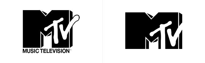
MTV: The original logo (1981) and the updated version (2010).
Whilst the identity for Network Rail may have gone unnoticed, you are unlikely to have missed the MTV ‘refresh’ announced earlier this week. Much like Network Rail, this is more of a realignment than an all out redesign, although the changes are possibly more noticeable. I initially thought the legs had somehow been mis-cropped, yet after my initial shock I think the new proportions work surprisingly well, possibly reflecting the evolution of television with this new, almost widescreen ratio.

MTV logo variations.
Like nearly every logo launched these days (London 2012, NYC & Company, AOL et al.) it goes without saying that this logo has been designed to act as a containing element, in which photos of the channels second-rate reality stars can be placed.
It’s an old idea (this in-depth article by Roger van den Bergh gives you an idea of just how long this concept has been around), but it is worth remembering that MTV launched with a similar identity 29 years ago. In fact, the logo has long been a canvas for viewers to make their own mark on the channel, although that concept seems sadly missing in this latest interpretation.
City of Melbourne
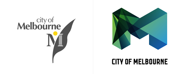
City of Melbourne: The previous logo and the new version.
Finally, if we are to talk about ‘M’ shaped containing identities, then I can’t leave without mentioning my favourite identity project of last year for the City of Melbourne, which frankly blows MTV’s mediocre efforts clean out of the water. Aren’t these just fantastic?
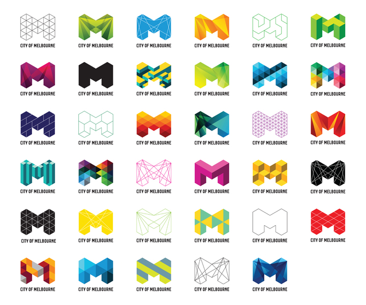
City of Melbourne logo variations.