Last Friday I attended Responsive Day Out 2, follow-up to last year’s event at which I spoke. The format was the same – sessions split into three short 20-minute talks followed by a 15-minute joint discussion – but the tenor was a little different. Gone were the theoretical presentations, talk of trying to sell responsive web design to clients and fears of embarking on responsive projects. Instead presentations focused on the actual doing; getting into the nitty-gritty.
There was one change to last year’s format: the event concluded with an hour-long keynote by Ethan Marcotte, who used his talk to advocate laziness – or rather discourage the building of overly complex systems. Using an example from his work on Editorially, Ethan explained that by using the nth-child selector in CSS, he could create a simple grid without using a pre-existing grid framework. There’s no shortage of responsive frameworks, each promising to make a developer’s life easier, but are they always that helpful?
Ethan proposed the development of a broader framework, one that guides the work we do. He referenced the twelve basic principles of animation as developed by Frank Thomas and Ollie Johnston at Walt Disney’s studio during the 1930s. These were described in their book The Illusion of Life, and beautifully animated by Cento Lodigiani:
This begged the question: what principles might apply to responsive web design? As I pondered this over the weekend, I realised many of the talks we heard gave hints to what these might be.
Five Responsive Principles
1. Responsible
What is responsive web design if not an attempt to treat users with respect? In adopting this practice, we no longer dictate how websites should be viewed but have moved towards a more discursive approach, one that is adaptive to user needs. Yet this responsibility should extend beyond concerns about page layout; performance and accessibility are just as important (if not more so) as these aspects actively limit who can and can’t access the products we’re building.
This principle was explored in surprisingly great detail (especially given the 20 minute time limit) by Sally Jenkinson in her talk More Than Media Queries. Every choice we make will impact the user to some degree, so we should bare in mind the ethical consequences of our decisions.
The following day it was revealed the extent to which a Facebook survey had deliberately manipulated users emotions. If ever there was a sign that our industry needs to take ethics more seriously, this was it. (If you want an introduction to this topic, I suggest watching Cennydd Bowles’ talk from earlier this year.)
2. Polylithic
Responsive web design has encouraged the development of modular code bases and more considered design systems. Given the inherent complexity of building products that exhibit such a degree of flexibility, pulling them apart and into component pieces makes dealing with the whole much easier. There is a lot we can learn from existing software development practice – the UNIX philosophy looks particularly well-suited.
But what aspects of HTML and CSS, as currently defined, make polylitihic design more difficult? Right now it’s difficult to build truly adaptive components when we can only query values that exist at the viewport level. Dan Donald made the case for ‘element queries’ (by no means a new idea) a technology that would allow us to design components that are truly independent from the page. By quickly spiking a concept using JavaScript and PHP, Dan was able to explore the opportunities such a feature would enable. It also allowed him to think about use cases, something that’s desperately needed if browser vendors are to ever implement them.
We should also look at those technologies that are being introduced, and ask how they address the first principle. Web Components look promising, but we should ensure their use doesn’t come at the cost of accessibility and security, something we often take for granted with native browser components.
It’s not just implementations that need to be less monolithic either; we require more agile tools that do one thing well but can easily be combined with others.
Stephen Hay talked about sculpting text; designing an interface by starting with plain structured text and styling it using the development tools available in browsers. Photoshop may still be a useful tool in our arsenal, but it’s no longer the one true app for web design (if it ever was). Task runners like Grunt allow us to automate our workflow by piecing together different tools. How might design centric applications fit into this environment? Sketch allows for plugins; imagine the possibilities if it could be scripted via a Grunt task!
3. Pragmatic
Given the diverse and unpredictable landscape we support, our work involves a great deal of compromise. Having an eye on the future can help as make better decisions as we consider to what extent compromises need to be made.
Rachel Andrew gave an overview of the new CSS Grids module. Currently only implemented in Chrome Canary (and enabled behind a feature flag), once widely supported, this module will allow us to truly separate presentation from content; no longer will we need worry about source order. Knowing this might influence a decision regarding HTML semantics versus layout complexity.
I’m reminded of Jason Grigsby’s approach to responsive images. His 8 guidelines and 1 rule balance the reality of browser support for a responsive image solution today with a eye to the future where responsive images are a solved problem.
Pragmatism was certainly the theme behind Inayaili de Le�n’s talk. At Ubuntu, her team needed to make their existing site responsive without changing its design or content. Familiar patterns emerged: the project was achieved by tackling it in smaller parts, with a focus on creating reusable components.
4. Collaborative
I’ve written about this previously, but increased collaboration between designers, developers (and project stakeholders) ultimately leads to better products. Ideally everybody involved are multi-disciplinary to an extent, T-shaped in their range of skills (a designer should have enough familiarity with CSS to allow them to style a page using developer tools, for example).
This was brilliantly demonstrated by Ida Aalen, whose case-study described how a close working relationship between designers, developers and the client resulted in phenomenal conversion numbers for the Norwegian Cancer Society. This was achieved by using core model thinking, focusing on those pages that address both business objectives and user tasks – again, seeking an area in which different people can come together to achieve the same goal.
5. Flexible
The final principle is flexibility, not in terms of layout, but in terms of our thinking. As we continue to understand the continuum of the web, and as the web finds its way on to an ever growing number of platforms (with and without screens), our approach constantly needs to adapt.
Oliver Reichenstein offered an entirely new approach to IA, with a container model that dispatched columns and broad navigation bars whose content is mirrored on the home page. Oliver’s talk was given without slides, so if you were wondering what this container model looks like, my colleague Nick Haley describes how we’ve been using it on the new Guardian website.
Kirsty Burgoine spoke about how, having decided to build responsive websites for her clients by default, see followed a sometimes painful journey in search of an ideal process, before realising there is no correct process at all.
This is one of the things I took away from the Responsive Summit two years ago. Mark Boulton described the work we do as “messy”; there is no right or wrong way; only a process of discovery and experimentation. Design is not a science (no matter how much people try to argue otherwise) and mistakes will be made. All the more reason to better involve our clients; constant communication and expectation setting remains key.
We also need to be more open-minded in how we approach platforms like iOS and Android. Developers on these platforms happily leverage web technologies in their products, but can we say the same? Of course, we should build products true to the nature of the web rather than aimlessly try to ape what’s possible on native platforms. But maybe we should defer to user agents and native UI a little more often, rather than constantly reinvent the wheel and second-guess context.
Stephanie Rieger’s talk primarily focused on the CSS Level 4 media queries (which sound unlikely to be that useful in the grand scheme of things), but she also talked of an idea that would enable parts of the UI to be deferred to the user agent. For example, the following HTML:
<nav is="native"><ul><li>Item one</li><li>Item two</li><li>Item three</li></ul></nav>
would tell a browser to handle this navigation list by using controls native to the platform: on a TV this might be a large menu, in a car this might be steering wheel controls. This is purely theoretical, but we can apply this thinking today when we look at forms. Styling a form is never easy; maybe we should let browsers deal with their style and behaviour however its sees fit. In short, shouldn’t we be more lazy?
Defining the core principles that support the work we do is an aspect of (responsive) web design I’d like to explore further. Indeed, I’ve been thinking about what to write and talk about next, and the above points – their suitability and accurateness – seem like an area worth thinking about more.
A huge thank-you to Ethan for greasing the rusty cogs in my brain, the speakers for taking the time to share their work and experience, and Jeremy, Kate and Clearleft for putting on another fantastic event.
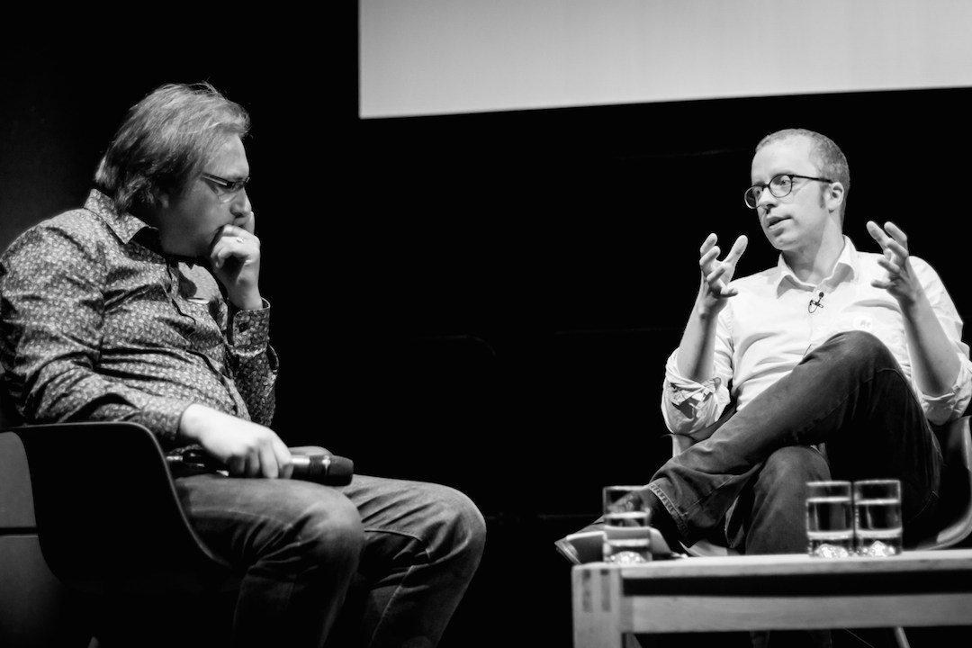
Photo by Marc Thiele.