A Comparison Between the Apple II and the iMac
When Apple’s first computer, the Apple I, was released in 1976, computing was reserved to hobbyists, many of whom adapted their computers or even built their own. Designed by Steve Woznaik, the single circuit board that constituted the Apple I was regarded as a work of art by his fellow hobbyists and also by his old school friend Steven Jobs. Having an eye for the future, Jobs insisted that he and Woznaik try to sell the Apple I, and so on April Fools Day 1976, Apple Computer was born.
Aimed at the hobbyist rather than the consumer, the Apple I did not come in a case. That was left to the user meaning no two Apple I’s were the same. Variations in case design ranged from simple pine boxes with integrated keyboards, to brushed aluminium and black metal boxes with rivets down the sides. One user installed his Apple I inside a leather briefcase with the circuit board in the top and the keyboard bolted to the bottom, creating the first laptop computer.
A standard design for a personal computer did not exist – in fact the idea of a ‘personal’ computer was inconceivable. This was proved by a statement made by a Hewlett-Packard executive when Wozniak offered them the Apple I design, who stated People will not want computers on their desks at home
.
The Apple II
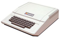
The introduction of the Apple II in 1977 was the first step in changing this view. This was basically an improved version of the Apple I with a couple of additions. It also differed by enclosing the circuitry in a case. Made of plastic, this was the first personal computer to do so.
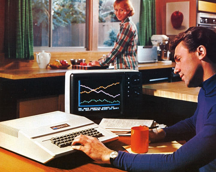
Unlike anything before it, the Apple II was marketed towards the general public as a complete and ready to use computer. This meant the design of its case was an important aspect. Steve Jobs was aware of this, so before employing industrial designer Jerry Manock, he took inspiration for its design from household appliances on display at a local department store.
The shape of the Apple II was dictated by the size of its circuit board and keyboard, yet remained tall enough to allow expansion cards to be vertically slotted into expansion slots on the circuit board. The front of the machine, were the keyboard was situated, was angled downwards the user to allow easier typing.
 Visually dividing the front from the rectangular rear portion was a narrow trench that ran above the keyboard, along the width of the machine. Above this trench and to the left were two chocolate-brown badges, one baring the apple logo, the other the model name, both reinforcing the machines unique identity.
The rear portion had short vertical vents that wrapped round the sides and extended slightly onto the top, removing the need for any noisy fans to dissipate the heat produced by the power supply. It was these vents, as well as the wedge created by the slope of the keyboard and the 45 degree chamfers on each corner, that helped to make the case appear smaller and less boxy.
The beige colour of the keyboard and the case was chosen to blend in with other items in the home or on the desk. There were no visible screws or bolts (the screws were located underneath) and the lid could easily lift off to allow easy access to the expansion ports inside. The most important aspect of the design however was the choice of a plastic casing over a metal design. This strengthened its identity as an appliance and essential if it was to be seen as a consumer item.
Steve Jobs wasn’t only interested about the design of the machine though, realising that many other factors influenced buyers. One area of concern was Apple’s logo, which at that time was a picture of Isaac Newton sitting under an apple tree. He saw this as one reason why sales of the Apple I were slow and brought in the Regis McKenna Agency to design a new one.
![]() It was a young art director named Robert Janov who set about designing the new corporate logo. He realised Apple was selling to consumers and that the Apple II was one of the first computers to offer colour graphics. He designed an apple motif with a bite taken out (playfully commenting on the fact that computers used ‘bits’ and ‘bytes’) with six bands of colour running across it. When he suggested that these bands should be separated to make reproduction easier, Jobs refused – insisting that the apple be reproduced with its full range of colours too, despite the cost.
It was a young art director named Robert Janov who set about designing the new corporate logo. He realised Apple was selling to consumers and that the Apple II was one of the first computers to offer colour graphics. He designed an apple motif with a bite taken out (playfully commenting on the fact that computers used ‘bits’ and ‘bytes’) with six bands of colour running across it. When he suggested that these bands should be separated to make reproduction easier, Jobs refused – insisting that the apple be reproduced with its full range of colours too, despite the cost.
Another area of concern was the Apple II’s manual. Originally provided with a sparse manual of thirty photocopied pages with some handwritten notes from Woznaik, it was replaced in 1978 with what was called the Apple II Technical Reference Manual. Steve Jobs realised that people often viewed a product by the quality of its documentation, so went to great length to replace the original manual with one that was easy to read and had a professional appearance.
It was this attention to every detail from the colour and material of the machines case to the design of their logo, that undoubtedly helped Apple reach sales of $7.8 million by 1978 and allow them to claim in its advertising that the Apple II was the world’s best selling personal computer
.
The iMac
Apple’s success was short lived. The introduction of the Macintosh in 1984 was initially successful but due to its small amount of RAM and lack of hard drive connectivity people soon lost interest. Not long afterwards boardroom arguments led to the resignation of Steve Jobs who left to form is own company – NeXT.
Apple’s acquisition of NeXT in 1996 brought Steve Jobs back to the company and by 1997 he was back in charge of the company. His return couldn’t have come sooner. Despite fairly good sales in the specialist areas of design and publishing, Apple’s share of the consumer market had dwindled significantly since the introduction of IBM-compatible PC’s and the Windows operating system. Apple needed a popular consumer product if it was to be a successful company again, and one completely different from anything else available.
The result was the iMac, and the man responsible for its design was London-born Jonathan Ive – Apple’s Vice President of Industrial Design.
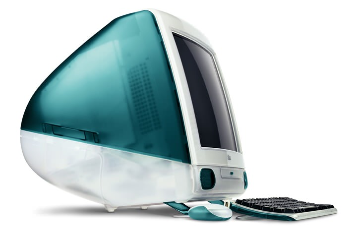
Key to the iMac’s design was the idea of simplicity and understanding of the emotional value of objects. Steve Jobs was looking for a design that looked futuristic yet (given that newness can often site uncomfortably with consumers) a design that was vaguely familiar which would conjure up memories of something you you may have seen before but were not quite sure. The design team was looking for a design that wasn’t like a computer, but also one that didn’t end up looking like a television. The final result was a curvy bubble like appliance that immediately caught the world’s attention.
Its main features were the bringing together of the monitor and the computers circuitry and devices into one casing, with a matching keyboard and uniquely round mouse. One of the first things the designers did was to move the connectors from the back to the right-hand side – not only allowing the back to be as elegantly styled as the rest of the machine, but to make it simpler for the user to attach and remove cables also.
The front of the iMac was more restrained than the rest of the design so as not to distract the user from the operations they were performing on the screen. Directly below the screen lay the CD drive and to either side of this were two speakers as well as a power button and headphone jack. The underneath featured a hinged foot that could be pulled forward so as to change the angle of the screen.
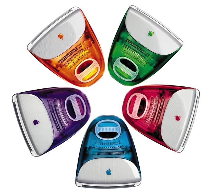
The iMac launched with a two tone case comprising a teal-blue colour (labeled ‘Bondi-Blue’) and a greyish white colour (called ‘Ice’). These names were chosen to conjure up ideas of water and surfing and therefore appeal to a young audience. They were also chosen because the iMac’s main selling point was its ability to easily ‘surf’ the Internet.
Translucency was a key feature of the design, chosen to reflect the fact that, as translucent colours vary under different lighting conditions, so does a computers purpose – from modern-day typewriter to home cinema, painting canvas to record player.
 Whilst mots aspects of the design featured translucency (even the plug and the cables were translucent), the translucent plastic on the front was backed by opaque plastic which was given a subtle striped effect.
Design cues of the CPU were also mirrored in the keyboard, which shared the same subtle stripe effect and retained a similar adjustable foot to change the angle of the keyboard. The mouse was translucent too, allowing you to view the two-tone mouse ball spinning round inside. The size and shape of the mouse was decided on by Ive after foraging on a beach looking at various pebbles for inspiration.
Later the Bondi-Blue colour was replaced with Blueberry (a lighter bluer colour), and four other colours were introduced. For the first time the consumer could decide the colour of their computer – something they were able to do with their cars decades ago. With the second major revision, a new graphite (grey) colour was introduced which was more transparent than the five other colours and was aimed at a more conservative user.
This second revision saw a refinement of the original design – a sleek slot loading CD/DVD drive replaced the cumbersome CD tray, the speakers became more rounded and the inner metal shielding was removed so you could see right through the case. The inside fan was also removed to ensure quieter operation.
Another subtle improvement occurred when you put the computer to ‘sleep’ (a sort of standby mode). Now the button pulsated with an orange glow like a heartbeat, designed to give the iMac a personality. Others such touches included an information label on the bottom of the computer written in a first person perspective i.e: I was assembled on UK
and My family number: M5521
. These details were added to increase the users emotional attachment to the machine.
![]() As with the Apple II, the manual was an important aspect of the design. The iMac’s original manual was entered into the Guinness Book of World Records for the being the world’s smallest, containing only 32 words – a statement that further stressed the simplicity of owning an iMac. Further still, the iMac was another product to influence Apple’s logo. With the introduction of the iMac, Apple altered its logo to match the translucent styling of the iMac, and with its success, replaced the original with this new version appearing in various colours.
As with the Apple II, the manual was an important aspect of the design. The iMac’s original manual was entered into the Guinness Book of World Records for the being the world’s smallest, containing only 32 words – a statement that further stressed the simplicity of owning an iMac. Further still, the iMac was another product to influence Apple’s logo. With the introduction of the iMac, Apple altered its logo to match the translucent styling of the iMac, and with its success, replaced the original with this new version appearing in various colours.
Conclusion
The Apple II and the iMac both revolutionised the design of the personal computer. The use of plastic and the beige colour was an important design feature of the Apple II for it to be seen by consumers as something they would like to have in their homes, and set a standard that others then followed.
By the time the iMac was launched, beige was the de facto colour for the computer, as were the similar designs of monitors sitting on, or next to, large rectangular boxes. When some companies tried to produce computers that you would want in your lounge, they often chose black and were unsuccessful every time. The choice of blue and white, coupled with such a radical design, may have seemed even more out of place but people quickly found that this design sat surprisingly well in the lounge environment, as well as on their desks at work.
As the Apple II set trends, so did the iMac, much to Apple’s annoyance. Now the solution had been found, other PC companies are using translucent casings; some deliberately copying the iMac’s design, and ending up in the courtroom as a result.
The Apple II and the iMac are similar in that they both introduced the consumer to new and emerging technologies and made them easy to use – the Apple II being personal computing and the iMac the Internet. In fact a lot of similarities can be found between the two machines (the removal of the noisy fan for example) and this has a lot to do with the fact that Steve Jobs had a big part in the design of both.
With his understanding of the emotional value objects can have to the user, and the fact that consumers pay attention to design, both were and remain successful designs.
Reference
- Blair, D. (1998). Bondi-Blue: Interview with Jonathan Ive. Thing.net. Archived from the original on
- Tracy, E. History of Computer Design. bebob.chass.utoronto.ca/~edtracy
- Stafford, A., Feld, A. & Poultrey, J. (1998). The Ive League: The Designer Behind the iMac. MacHome Interactive. Archived from the original on
- Weyhrich, S. (1991). Apple II History. Apple2History.org.
- Unknown Author (2000, April 4). Apple reaches the end of the rainbow. MacUser, 14.