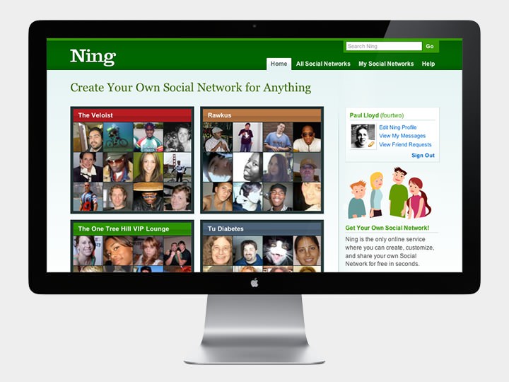
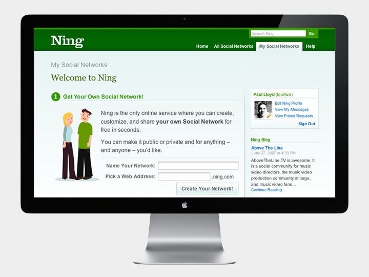
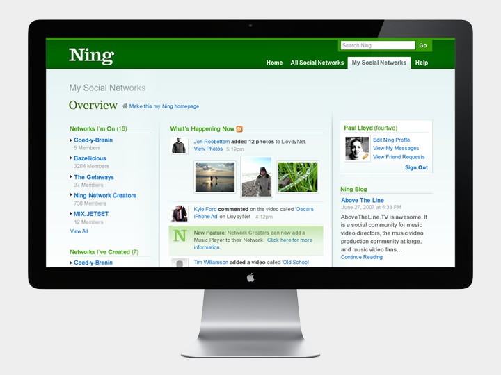
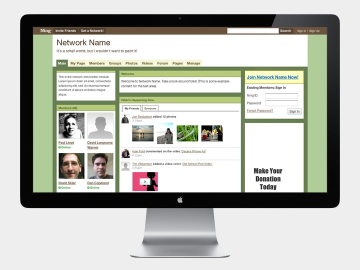
Ning is an online platform that allows people to create, customise and share their own social networks. I was Lead Designer from January 2006 - October 2007.
In close collaboration with David Warner, I helped launch the company’s core product offering ‘Your Own Social Network’, designing and developing the underlying HTML framework, customisation system and initial set of themes. In addition to product development, I was also responsible for the design of the company’s marketing and support sites, which was lead by a distinctive Clarendon logo that somewhat stood out against other glossy bubble logos that were popular at the time.
Recommendations From Colleagues
Steve Vassallo, VP Product:
Paul is hands down the best web designer and CSS craftsman I have had the pleasure of working with. From overall user experience to the smallest, pixel-tweaking details, Paul is exceptionally creative and thoughtful.
David Warner, Senior Interaction Designer:
Paul and I worked closely together for a year as the 2 people responsible for the design and HTML/CSS code for Ning. Paul is a very gifted graphic and interaction designer who works hard and quickly. He is also one of the strongest HTML/CSS coders I’ve ever worked with. He cares passionately about his work and it shows: high quality and attention to detail.
Dan Copeland, Lead Application Developer:
Paul is an amazingly talented designer and a great person to work with. He has a very strong work ethic, is always learning and keeping his skills up to date, and truly takes responsibility for his projects.
Brian McCallister, Core Architect:
Paul is an extremely talented designer who tackled difficult problems at Ning and delivered with aplomb. Aside from excellent graphic design skills, he created a structural framework for building up a wide variety of different appearances on the same document structure.
Jonathan Aquino, Senior Engineer:
Paul gave Ning its look: from its distinctive Clarendon logo to the HTML and CSS undergirding Ning’s 150,000 social networks. Working with Paul’s semantically rich CSS designs is a pleasure. With the simple addition of a CSS class like “response”, amazing things would happen to an HTML element: the avatar would shift to the opposite side, the speech bubble flip on its vertical axis, the colors change subtly. He writes of his “passion for web standards and attractive design” – it certainly shows in his beautiful work.
