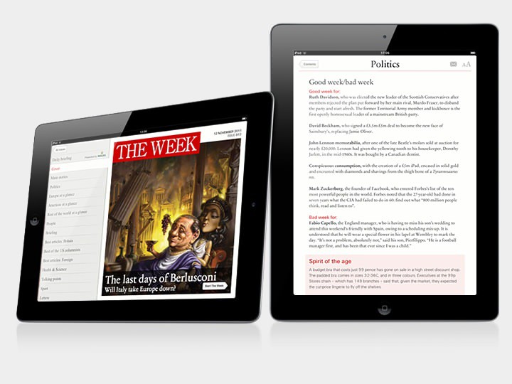
The Week iPad Edition
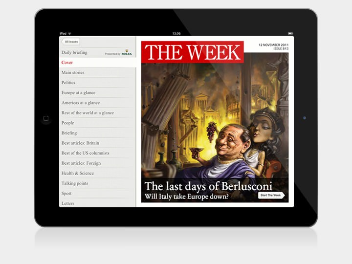
Issue Cover
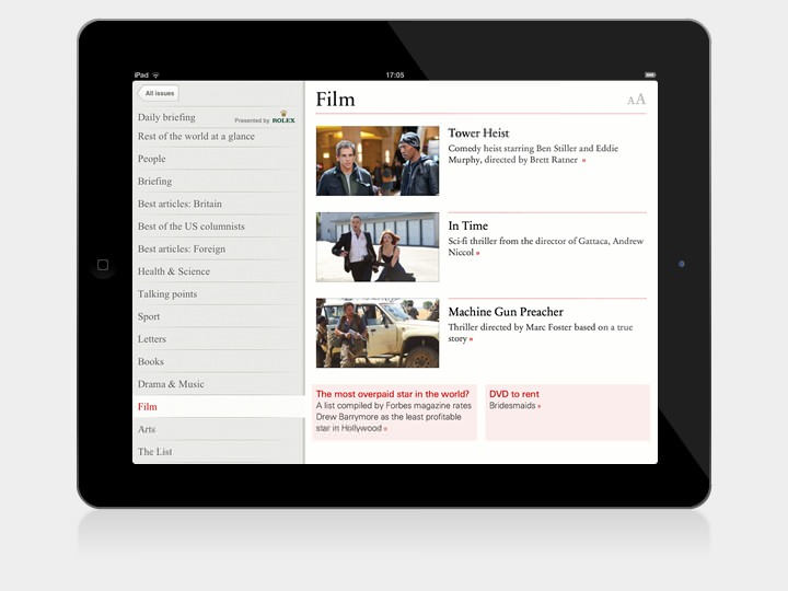
Film overview page
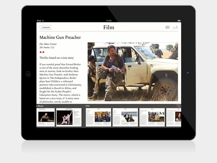
Film review
Text resize options
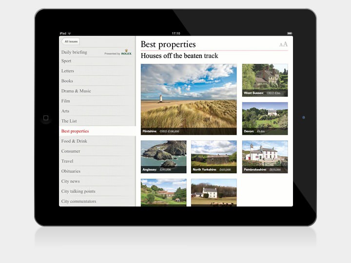
Best properties overview page
The Week magazine condenses the news into lively and informative editorial, giving readers an insight into the week’s most vital stories. With over 183,000 subscribers, it’s also the UK’s most popular weekly subscription magazine. Part of this success can be attributed to a rigorously consistent editorial format which readers describe as familiar, reliable and intuitive.
Myself and Harry Brignull were tasked with bringing this much loved publication to a new generation of tablet users; retaining the best qualities of the print edition whilst also creating a product true to the best abilities of the iPad.
With a readership not looking for rich interactivity, embedded videos or masses of hyperlinks, we focused instead on creating an easy to navigate interface that privileged the reading experience. A highly iterative approach saw the design evolve over the course of the project; working first with paper sketches, then click-through keynote prototypes before finessing the design in Fireworks; all whilst using real content from the magazine to ensure what we were designing would actually work!
Working closely with the development team at Kaldor, we then honed the gestural interface, navigation and page templates. Building upon their hybrid PugPig framework, the application could take advantage of native iOS features and also utilise HTML and CSS for precise layout and typographic control for each article.
Features include an archive of back-issues, adjustable text size, a night reading mode and automatic downloading through Apple’s iOS5 Newsstand. It’s available now on the App Store.