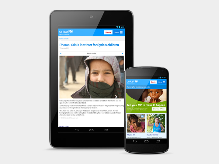
UNICEF UK is a charitable organisation that raises money in aid of children and children’s rights. Like many organisations, UNICEF has seen an increase in mobile traffic, with mobile devices accounting for approximately 20% of site visits. Having recognised the need to support small-screen devices, a limited mobile version of their website had been produced. However, much of the information about their vital work remained on the desktop-orientated site, which featured large imagery, complex interactions and small text.
From desktop-first to mobile-first
With a constrained budget and tightly scoped brief, me and Ben Sauer were tasked with expressing this existing content and information architecture in a way that could be understood on smaller screens. The site also needed to degrade gracefully on older mobile devices, taking into account the often imperfect nature of cellular connectivity. Put simply, we needed to employ mobile-first design principles with desktop-first content, rationalising and simplifying wherever possible.
With this in mind, we asked key stakeholders on the project to dissect the home page and a key internal page, placing component parts in order of importance. We then worked with UNICEF’s content editor to pull out common patterns, noting those which were essential, and those that were superfluous. We sketched the relevant patterns on a whiteboard, imagining how they would adapt on smaller screens. These could then be interpreted as HTML and used as the basis for my front-end build. This pattern-based approach allowed us to simplify what was already there, rather than starting again from scratch.
We experimented with different ways of simplifying way-finding around the site, remove unnecessary interactions and invoking less taps. We removed layers of navigation, and advocated including more links within body copy. We also moved breadcrumb navigation into a slide out menu, allowing users to orientate themselves within the site.
Considerable effort was spent to ensure performance didn’t suffer at the cost of excessive design. UNICEF’s extensive brand guidelines helped in this respect, their identifiable cyan brand colour and emotive photography providing enough identity. In a break with their out-dated web brand guidelines, I opted to use the Roboto typeface instead of Verdana. Not only was Roboto similar to UNICEF’s brand font Univers, but created specifically for newer Android devices, we knew it would render well on mobile screens. Its condensed nature would also allow for more comfortable line lengths on narrower screens.
A firm foundation to build upon
We were able to create a design language that could encompass the various template types, clearly delineating areas of navigation and content. Although a mobile focused project, we had a secondary ambition to design an experience that is better than the desktop site – even on a desktop. In time, it is hoped this responsive mobile design will form the foundation of a fully responsive site, accessible from all devices, large or small.