Monday saw the much anticipated reveal of the most significant identity to launch in Britain since that of the Millennium Experience in 1999. My immediate action upon seeing it was one of restrained joy – it was great to see something new in a category of identities that have remained pretty conservative and predictable over the last 40 years.
As I look at this identity more, it quickly becomes obvious that it has a number weaknesses as well as strengths. Yet sadly the proper debate about the relative merits of this logo have been sidelined by the usual sensationalist journalism that we have come to expect in Britain.
Fellow Multipacker Andy Higgs had this to say about the new design:
Although I think popularity around this will grow in the short term, (or indifference will culture) this was a bad decision, too risky, and possibly heading to be the appropriately lasting icon of a publicly-funded financial sieve.
I’ve been meaning to write about this since the announcement, but Andy’s post spurred me into writing a response on his blog, some of it I will echo here. To me, his post worried me, as it seems that people opinions are being cast without the due diligence such an identity deserves. Personally I have mixed thoughts, which I will talk about in a moment, but first I want to talk about the medias response.
The response
When it comes to matters of design, the mainstream press seems to have a very sensationalist approach, and always seem able to provide the same two arguments: It costs too much and and we didn’t need a re-brand in the first place. Let me tackle both of these issues head-on.
It’s an unnecessary re-brand
Correction – this is not a re-brand. This is a logo for an Olympic Games – used to promote the event, it’s ideals and to give it it’s own unique identity amongst previous and future games. Outside of the great sporting moments that will hopefully take place during the two weeks, this icon will in time become a signature underlining the games and the events that took place.
The Olympics have always been closely associated with the arts as well, so the logo is a great place to start if you want to add a design stamp on the games. In fact the games of Mexico in 1968 and Munich in 1972, still have relevance today in design circles as they set trends and pushed the boundaries in both identity and information design.
This mark is of the Olympics as they will be in 2012, and of what they were in 2012. This mark has to sell, and then it has to last. A pretty tall order.
The previous logo was that of the bidding process. It’s competitors were the other candidate cities, and the identity was to promote the city, and it’s ability to host an Olympic games.
Those two goals are entirely different, and in this brand centric world having such different needs requires two entirely different identities. Believe me, I’d be the first have that not be the case, but brands are now our masters, and they need to work.
It cost too much (�400,000)
I always love this argument. Sometimes it’s true, but usually it’s complete tosh. It feels great to have your profession devalued so easily by those who have no understanding of it.
I ask you, what if it this cost half the amount? What if it cost �20,000? Would people still be complaining that the cost was too high? Of course they would, as it’s a great angle (an all too easy, journalistically lazy angle) on a story. How about an actual intellectually informed critique of the good and bad aspects of this logo, it’s strengths and weaknesses, and then perhaps if you think that it doesn’t perform as it should, then complain about it’s cost.
Note also how everybody has published the pink and yellow version of the logo, opposed to the more conservative colour options. Why? Because it’s easier to generate a reaction, and thus sell papers.
As I’ve already stated, this identity has a lot of work to do. Not only has it got to stay in peoples imagination for six whole years, it then has to work as a part of a legacy (and hopefully a good one at that).
It amuses me that the BBC put together a gallery of user submitted entries (all of which were incredibly bad), and then promotes it as a way of suggesting anybody could design the logo. Are they really suggesting that if one of those was the selected logo of the games, they could stand by it. Please.
Also amusing are the comments that this looks like the Nazi Swastika. Godwin’s Law has yet to be proven wrong.
The Epilepsy Debacle
I also want to quickly touch upon the issue of the promotional film. From what I’ve read, before it was played at the launch event, it was preceded with a warning that it was not safe to to be viewed by epileptics. Broadcasters then went on to replay it without this required warning.
As I see it, this is an issue with the television companies, not LOCOG, or Wolff Olins. But now that the anti-logo bandwaggon is in full swing, we’ll see the cheap headlines like ‘Logo causes epileptic fits’. The fact is that the logo has very little to do with this at all. I should also add that I think this promotional film is the weakest part of this identity, and I just hope that as the brand ‘evolves’ that something a bit more original can be thought up.
It upsets me that the British media always falls into the same trap. This is our showcase to the world, yet once again we’ve demonstrated, that whilst we can come up with great ideas and something new, we always become downbeat and then inwardly criticise ourselves. It’s the predictable build it up, knock it down agenda, and it’s upsetting to see this constantly played out in the media. I’d just like to see an honest discourse for a change.
The Identity
As I mentioned in my introduction, I was actually pleased to see this logo when I first clapped eyes on it on Monday. My initial happiness, and also pride, was in seeing something that immediately changes the rules of what constitutes an identity for an Olympic Games, and perhaps wider expectations of what a logo should look like too. We can safely assume that the logos for future games and candidate cities will be a lot less conservative.
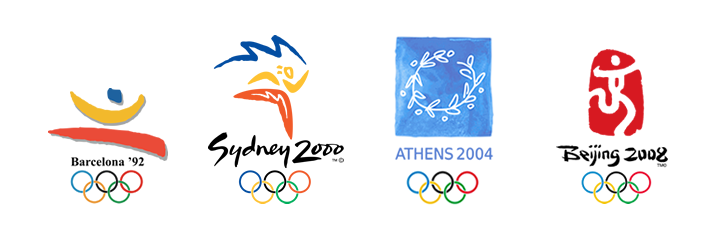
Previous Olympic Games have all used similar designs for their logos.
I can’t tell you how relived I am to not see a stylised flame, Big Ben, or an athlete, in red, white and blue. If we ended up with an identity like that, maybe the press would have been pleased, but our mark on Olympic history would quickly have been forgotten, if we were to make a mark at all.
Whilst this doesn’t immediately say ‘Britain’, or ‘athleticism’, I think on a more subtle level it does. Firstly Britain is well renowned as a nation of innovation and design, and those are certainly aspects we should promote in an identity of this nature. As to athleticism, it does have a certain energy about it.
Often those designs that create the most outcry, are those that tend to last, as well as become incredibly popular.
Think of the iMac, the Ford Sierra – two product designs that immediately come to mind, both of which had daring designs and were criticised at launch. But both went on to outlive their shelf lives as their designs proved to be popular.
People don’t like change, but what is life without it?
Coudal Partners came up with ten reasons why this identity should be applauded (it’s simple, it’s not boring, it’s timeless, and on a more practical level reasons such as it’s easy to reproduce, and can form the basis for a graphic system). I would add to that another benefit: it’s internationalised (the design requires no translated versions). The argument that this cost too much is looking increasingly stupid.
But there are issues, and some pretty big ones at that.
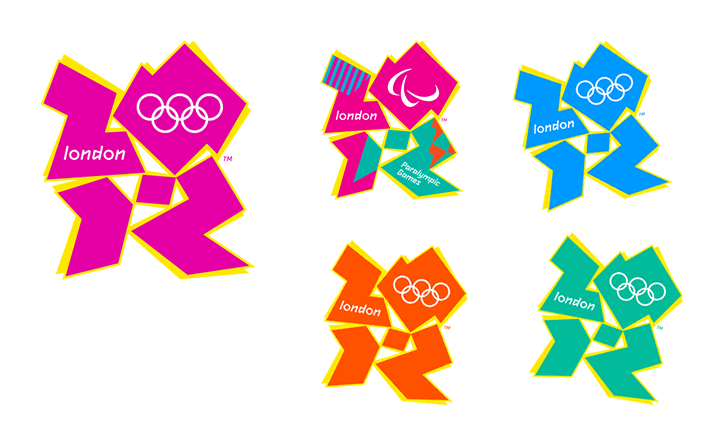
Whilst I like the idea of using the date 2012 (the first twenty-something event in peoples minds, so already it sticks out), it took me a number of takes to realise this. I’ve also seen commentators ask why there is a hyphen between 20-12, but on closer examination I believe that to be part of the 2 – but I’m only guessing.
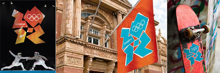
Possible logo applications.
Not least of it’s problems are that it’s been designed to appeal to children, teenagers; or ‘da yoff’, but this design seems incredibly obvious in that respect. It’s a bit like your grandparents wearing trainers and a baseball cap, or the Presidential candidates having MySpace pages – the target audience sees straight though it, the net result being your brand is seen as ‘sad’ rather than ‘cool’. I think there is a real chance this identity will be rejected by those it’s being aimed at.
Unfortunately, this is the mark of a Wolff Olins identity – whilst strong, they always fall into the obvious category - Orange (the word orange in an orange box), BT (a piper stylised with flashes of the Union Flag) – I could go on. I’m not a massive fan of this agency, and whilst I applaud their braveness, I’m saddened by the obviousness of their outcome.
Conclusion
So right now, as I come to terms with this design, I’m torn. On the one hand I’m really glad to see the organising committee show braveness, and actively try to look upon the opportunity provided by a London hosted games with fresh thinking.
At the same time, I’m slightly shocked by the outcome, but not for it’s design, but for it being so glaringly obvious. It seems to me they were about 3 revisions away from a great idea, yet instead we’ve ended up with something that alienates both it’s intended target, and perhaps the rest of us too.