Earlier this year the BBC announced it was creating a new version of it’s Global Visual Language (GVL). Building upon the success of its predecessor, these new guidelines would give the organisation a consistent yet highly distinctive visual style to use online.
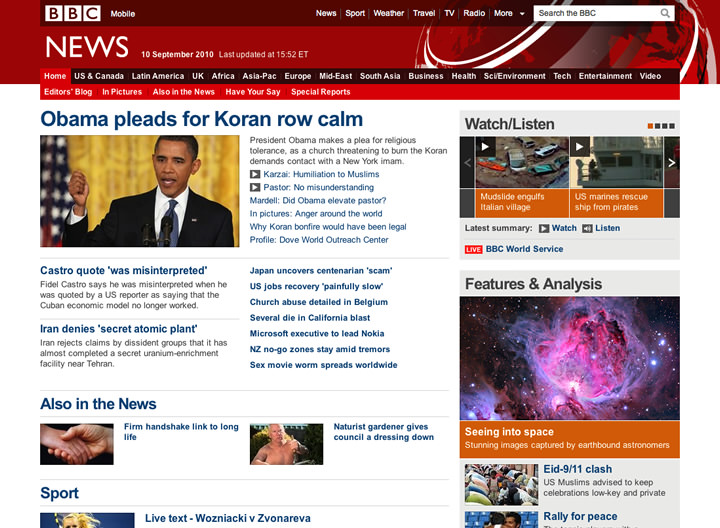
The new BBC News website.
Developed alongside respected designer Neville Broody, the new version – dubbed GVL3 – was based upon nine founding design principles, with outputs including a more flexible grid, controlled typography usage, specified colour palettes, iconography and documentation of common design patterns. Furthermore, the BBC website would slavishly adhere to these guidelines, meaning a site historically disparate and segregated would end up with a single, consistent and identifiable style.
It was with much excitement, that I wrote about this announcement in February.
Yet the months that followed saw relaunches across the site that didn’t match this promise. A new home page retained its dated ‘web 2.0’ look. A relaunched Doctor Who programme site, reportedly inspired by these guidelines, only served to disappoint with clumsy typography and unimaginative layouts. The refreshed Comedy website was ugly, ill-considered and incomplete.
In retrospect, it’s easy to see that these sites – produced during a period of transition – were unlikely to fully reflect the new vision, yet their launch made me question the BBC’s appreciation of design, and wonder whether the goals of GVL3 would ever be realised.
BBC News Site Launch
Fast forward to July, and the BBC finally launched a top to bottom redesign of its news website in full conformance with GVL3 – which itself launched as part of a larger Global Experience Language (GEL) project.
After years of minor face-lifts that papered over the cracks in an increasingly outdated and broken experience, the level of quality and attention to detail seen in the new site fills me with pride; no longer a site I feel embarrassed to use. As an organisation whose future is increasingly dependent on networked, on-demand services, BBC News Online can stand alongside the iPlayer as one of the great online experiences of our time, a new standard for other media organisations to follow.
Having used the site for a number of months now, I’m still amazed to discover tiny little implementation details – hover states, layout aware overlay menus, pixel precise positioning – a level of subtly I’ve not seen anywhere else on BBC Online. The iPlayer comes close, yet the design of the new version depends on a tacky visual gimmicky now banished by GVL3.
A Vocal Minority
I was overjoyed when the new site launched, but a vocal section of the public felt quite the opposite, leaving thousands of disgruntled comments on the BBC’s blogs and elsewhere. Many of these complaints boiled down to little more than annoyance that someone had dared change their comfortable familiarity, however I can understand a level of this frustration.
The previous website had evolved from an original design launched in 1997. Whilst the width grew to match popular screen dimensions, and mastheads changed to reflect the branding of the day, fundamentally it remained the same site; navigation running down the left hand side and news stories tied to a formulaic layout.
Not only does the new site break a number of expectations built up by users over the last 13 years, but the run up to its launch wasn’t as sympathetic to this situation as it needed to be. Unfortunately, the option to run a beta site alongside the previous design wasn’t possible, as the publishing platform powering the site was being redeveloped at the same time. I was privy to some late user-surveys, but for most users, the only indication that the site was about to change was a blog post and an image gallery.
The BBC is often careful to test new designs with its users, but this time it fell woefully short.
One Page, A Thousand Interactions
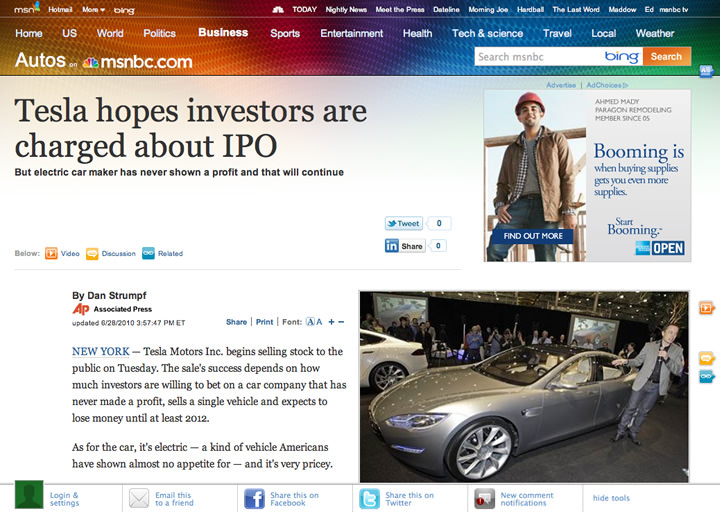
An article page on the new MSNBC website.
A few weeks before the new BBC News site launched, American news organisation MSNBC launched a redesign of its own. In the commercial world, the needs of advertisers are often valued over those of users and page views rule (thankfully the the BBC is not bound by such constraints). As such, news articles tend to be split across several pages and have become surrounded by intrusive adverts – it’s easy to see why tools like Readability and Safari’s Reader feature are gaining popularity.
MSNBC has a good understanding of the web (as can be seen with its acquisitions of Newsvine and EveryBlock) and realised this trend couldn’t continue.
Their redesign did away with pages, instead presenting content on one page; larger, easier to read body copy appearing alongside comments, slideshows, image leads and other features (for more information, see their detailed feature tour). Yet whilst ‘one page’ may be technically true, pages are actually divided into different sections that are viewed individually, navigated by a strange yet playful ‘bubbles’ that run down the right hand side of the page.
Whilst some of these interactions are interesting, it appears to be innovation for the sake of innovation. Comments can be opened in a drawer, site features appear when you scroll up and reach the top of the page, sharing tools are persistently anchored to the bottom of the browser window – every gimmick that can be used, has been used – the result distracting interactions in place of distracting adverts (the number of which has also increased). In reality, MSNBC is still stuck with the same page-view paradigm.
Built In Flexibility
Perhaps the BBC should point disgruntled users to MSNBC, as I’m sure they would come running back. With GVL3 in full effect, the new site takes this approachable homogeneity, and infuses it with the strong BBC News brand.
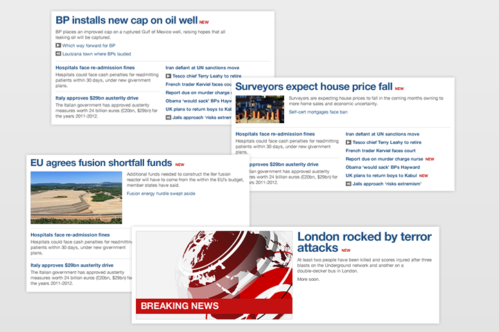
Different layout variations available to editors on the new BBC News website.
One of the key features of the new design is greater flexibility for editors, and this can clearly be seen on the new home page. Where previously strict templates required a main story be followed by two other leading stories (each with an associated images regardless how useful these may be), this new flexibility allows for a number of different page layouts, headline sizes and has no image requirements. The design is dictated by the content, rather than the other way round. This flexibility extends to section pages – flicking through these different pages perfectly demonstrates this new adaptability.
The same ideas have been brought to the article pages too. The original site was built with text based stories in mind, but over the years these have been added to by images, slideshows and video content. With more space available for content (the left-hand navigation having been moved to the top), a wide right hand gutter allows additional pieces of content to be inserted without impeding the main flow of the article.
This move to flexible layouts is interesting, especially since Clearleft have been working on a project for Channel 4 News that proposed similar solutions. Whilst this vindicates our approach, it’s a shame we couldn’t release our solution before that of the BBC.
Not Without Fault
Having a flexible layout for the home page is definitely an improvement, but this variation, alongside other persistent features, means the page can often lack a sense of hierarchy. The home page is a strange beast, bursting with modules, boxouts and promos, many of which I’d be tempted to remove. The customisable UK/World News feature, with its stark dark blue background, dominates the stories contained within, and I often find myself skipping past.
My larger concern is that the new GVL3 guidelines seem heavily influenced by the design requirements of the news site. BBC News is one of their few remaining consumer facing brands still using Gill Sans, with Helvetica used on-screen. Low and behold this is what we see reflected in the style guide.
It’s too early to tell of course, but the suitability of these guidelines for the whole organisation will only become apparent once it gains usage across the entire website, and implemented for brands with differing content requirements.
Open and Transparent
The design of this site, and the rationale behind it, have been incredibly well documented; it’s hard to imagine another organisation going to the same lengths to share its internal process. If you’re interested in the background to this new design, I strongly encourage you to read the following:
- Formative user research for the BBC’s Global Visual Language 3
- BBC News website redesign: telling the story
- BBC News website’s content management and publishing systems
- Full GEL documentation and resources
There is often talk of there being no landmark design on the web. I’m going to stick my neck out, and suggest it won’t be long before BBC News Online is considered one of the greatest design icons online today.