
Last week I was invited to Responsive Summit, a face-to-face discussion about Responsive Web Design. We talked about what we’ve learnt so far, the problems we’re continuing to face and things we’d like to change. And no, I didn’t get the Dr. Strangelove reference either.
Whilst some disliked the perceived exclusivity, I found it encouraging that Chris, Josh and Alex were able to arrange such a meet-up in just 6 days. Blogging about our thoughts and experiences is better than pithy tweets, but sharing them in person? That’s better still.
Lessons were learnt about how to arrange similar meet-ups in the future, but that’s not to say there wasn’t an opportunity for input from the wider community. Questions were submitted via the website and these helped us divide the discussion into five key topic areas:
- Workflow
- Layout
- Sensors
- Images
- Advertising
We also agreed to share our findings from the day on our blogs. I’m going to concentrate much of my report on the topic of responsive images; possibly the meatiest and most difficult challenges we’ve encountered so far.
Media Queries in HTML?
On many topics we found agreement, yet thankfully, there were areas of disagreement too.
Chris asked if we needed media query like behaviour in HTML. For example, a list of links might be better represented as a select menu in certain instances. I questioned whether such an approach would be a regression, taking us back to the ‘bad old days’ of mixing together presentation, behaviour and content. I still believe that structuring documents semantically, with CSS and JavaScript manipulating that information, is the right approach. Progressive enhancement is forever revealed as a guiding principle when crafting web experiences. I’d hate to see that change.
Josh Brewer facilitated the discussion. Original photo by Chris Armstrong.
The Picture Element
Yet Chris’s suggestion isn’t a million miles away from a proposal to handle images in a responsive way with a <picture> element. Much like <video> and <audio> in HTML5, this new element would allow requests to be sent for images matching inline media queries, falling back to an <img> element for browsers that didn’t recognise the new syntax:
<picture><source src="high-res.jpg" media="min-width: 50em" /><source src="low-res.jpg" /><!-- Fallback content: --><img src="low-res.jpg" /></picture>
Whilst this proposal provides much needed scope for improving the scalability around image content, I’m not sure if it’s a little over engineered. Would the reintroduction of the lowsrc attribute be simpler, and therefore see swifter adoption from browser vendors? Furthermore, are there not other solutions we can find that don’t rely on new markup?
Going Further with File Formats
I wonder if the solution actually lies in file formats. This is something I touched upon briefly in my last post, where I mentioned the much unloved JPEG 2000 format. Researching a little further, I discovered a number of other proposed formats, all of which could prove useful as we strive to build a responsive web:
JPEG 2000, intended to replace the older JPEG format, was introduced by the JPEG committee in 2000. This format generates higher quality images compared to standard JPEGs and produces smaller file sizes. Features include multiple resolution representation, progressive transmission, lossy and lossless compression and support for transparency mapping. Unfortunately, it’s not widely supported by browsers.
JPEG XR is a computationally lightweight alternative to JPEG 2000, developed by Microsoft in 2009. It also provides better compression (including lossless), greater colour accuracy allowing for up to 48-bit ‘deep colour’ and HDR images, transparency mapping, and metadata support. Originally known as Windows Media Photo, it is well supported by Microsoft’s own software. Although covered by their Open Specification Promise, I suspect there’s little desire from others to support a format patented by Microsoft.
WebP is a sister project to the controversial WebM video format developed by Google. This produces lossless images that are 28% smaller in size compared to PNGs, and lossy images 25-34% smaller compared to JPEGs – although image quality may not be comparable. It’s supported by Chrome and Opera, and can be used in other browsers via a JavaScript shim.
Do We Need a New Image File Format?
During the discussion at Responsive Summit, the idea of creating a new image format arose, but was quickly dismissed. If you think W3C specifications take a long time to reach implementation, that’s nothing compared to the standardisation process for file formats. Achieving widespread support across browsers would take even longer.
So then we started to look at existing formats. Mark mentioned TIFF files, which can contain multiple subfiles. This lead Alex to talk about the Mac OS X ICNS format; a bundle that contains different sized icons ranging from 16x16 to 1024x1024 that can serve a multitude of uses. Could something similar be used on the web?
This isn’t dissimilar to WOFF (Web Open Font Format), another wrapper format that contains either TrueType or OpenType fonts (i.e. pre-existing file formats) alongside some additional metadata needed for licensing purposes. This example is particularly encouraging, because it wasn’t long after the need for such a format was recognised, that font foundries and browser vendors agreed a specification and started implementing it.
This might be an potential avenue for exploration, but it’s not without problems. First, even if a format was specced and implemented in browsers as fast as WOFF, the fallback mechanisms for images aren’t as graceful. Within the @font-face rule and with traditional font-stacks, we have a high degree of fallback control. For images, our only fallback is alternative text (when available). I suspect users have a higher tolerance for incorrect fonts than they do missing images.
Secondly, and likely an issue with any potential solution involving file formats, is the method of creation. Any format would need support in popular editing packages for it to become a truly popularised; although plug-ins and extensions could satisfy this requirement in the short term.
What We Need Is a Portable Network Graphic
So rather than a new file format, or even a new container format, what we really need is an existing image format that can be extended, yet at the same time provide backwards compatibility.
What about PNG?
The trusty ‘ping’ has saved us once before. It was originally created in 1995 after the LZW compression method used in CompuServe’s GIF format became subject to licensing fees.
This format is interesting given two examples where it has been extended whilst maintaining backwards compatibility:
Fireworks PNG: As the native file format for Fireworks, it includes a variety of information: bitmaps, text, vectors, image masks, layers, states and pages. Whilst fully editable in Fireworks, when viewed in a browser or another image editor only a flattened image is displayed.
APNG: Mozilla’s Animated Portable Network Graphics format is another unofficial extension to the PNG specification. It too retains backwards compatibility; browsers that don’t recognise this format only see the first frame.
This suggestion isn’t without problems either. For starters, it’s doubtful whether a file containing multiple image sizes wouldn’t be accompanied by a huge file size. One would hope that some intelligence could be incorporated so that when lower resolution variants were requested, only the required amount of data would be sent (bonus points if the same behaviour was also backwards compatible).
Perhaps what we’re really after is the image equivalent of variable bit-rate, as seen in streaming audio and video. Imagine images that adapted their file characteristics based on available bandwidth and their resulting display size. Yes, I would also like a pony.
And with that, I’ve sufficiently demonstrated my naivety regarding image formats.

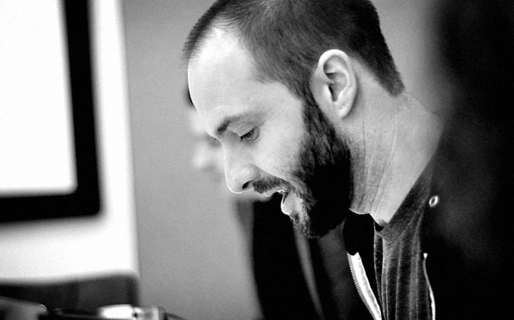
Me, in deep pondering mode. Original photo by Chris Armstrong.
Immediate Solutions
Without the luxury of responsive image formats or new markup patterns, or even the impressive hacks that have failed to work sufficiently, what can we do?
Josh has been using an interesting technique that follows on from earlier hacks, but almost embraces the point at which they fail. Again, his script ensures a small image is always downloaded, and larger images are only loaded when the conditions are right for them to do so. But, rather than try and guess which should be delivered upfront, the larger image is loaded in addition to the smaller image. Sounds crazy, but by downloading the larger image in the background, and only replacing the smaller one when ready, the apparent page speed is quicker, even though more data has been downloaded. Genius! He’s dubbed the technique ‘Responsive Enhance’, and you can try it out for yourself on GitHub.
Combining such a technique with judicious image compression, the right choice of file format, CDN hosting, cache control and a variety of other performance techniques, means we’re at least heading in the right direction.
Designing Around The Problem
I’m conscious that up until this point I’ve only been talking about technical solutions. As a designer, I’m drawn to a different approach. We should continue to push the constraints of the platform, but we shouldn’t be scared of designing around these limitations either.
Instead of displaying large images in a carousel, why not show a series of thumbnails that reveal larger images when selected (thus letting users chose whether or not they want to download the larger images). Maybe embrace the lower bounds of image compression; posterisation effects can be achieved with small indexed colour palettes, and highly compressed JPEG images can look, er… interesting?
With icons we have even more choice; be it using vector formats like SVG as I’ve done on this site, or icon fonts. These are gaining popularity due to their small size, flexibility and dare I say commercial potential!
Conclusion
This post is a bit longer than I was intending, yet it only touches upon one of the five topics we discussed during the summit.
Mark made a series of great points throughout the day, but the one that will stay with me is this. We’ve been designing fixed layouts for a thousand years. What we’re dealing with isn’t a new web trend or set of techniques, it’s a whole new way of thinking about design and layout – and we’re at the very forefront of it. Short version: there’s a lot to figure out!
Ultimately, we’ll tackle the problem of responsive images as we have others. Constraints will push designers to find the limits of the platform, and that in turn will generate new fashions and trends that evolve an aesthetic unique to the web. Meanwhile, developers will employ ingenious JavaScript hacks and polyfills that will guide the future direction of the web platform. And a combination of these techniques, in tandem with new processes and ways of working, will mean that designing for the web will remain one of the most exciting design challenges out there.
Want to be part of it? Write about the problems you’re facing. If you see a separation between the developers and designers in your company, work to change that (we’re going to solve this together, not apart). And organise your own summits – although choose a better title! Not only can you help push the web forward, but if you’re lucky, you might even get your hands on some Microsoft sponsored cake, too.