Last month I wrote about Bradshaw’s Guide, a project that brings George Bradshaw’s 1866 descriptive railway handbook to the web. Today I’ll cover some of the typographic decisions I made, and why I believe we still lack the necessary tools for web typography.
Bringing Order to Typographic Chaos
Although the content of Bradshaw’s Guide is well suited to hypertext, its chaotic and haphazard victorian typography, featuring a mix of fonts, weights and widths, felt somewhat at odds with the more structured nature of the web.
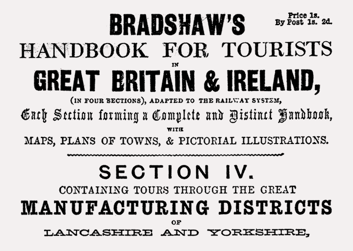
Scan of the inside cover of Bradshaw’s 1866 railway handbook.
To successfully mimic its design, a vast array of fonts and styles would be needed, requiring assets in size and number that would slow page loads and degrade the experience, especially on mobile. The challenge then, was to maintain this identifiable aesthetic, but in a performant manner.
Thankfully, beyond the cover and adverts, the guide is more consistently typeset, with different fonts and styles used to delineate content types. This structure gave me the confidence to keep my font selection limited.
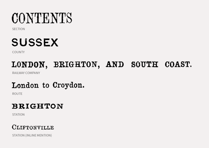
Typographic hierarchy used in the original Bradshaw’s Guide.
Font Selection
Finding the right fonts was a particularly drawn out process. Beyond the usual requirements – suitability, legibility on screen, price – I found myself drawing up a detailed set of technical criteria:
Freedom to host locally
Performance is a question of trade offs. While third-party web font providers tend to use best-practice techniques, they are also a bit of a black box. I’d much rather work this stuff out for myself.
Initially focused on reducing HTTP requests, I base64 encoded each font into the main stylesheet, producing a compressed CSS file 122kB in size. I’m now linking to each font separately. The combined total of styles and fonts comes in at a more respectable 97kB, and these assets can now be downloaded in parallel, which hopefully speeds things up a bit.
I’m sure further improvements could be made. Being able to host fonts on my own server gives me the opportunity to continue experimenting.
Openly licensed
While I’m not adverse to paying for fonts, openly licensed typefaces provide this flexibility. There is often a perception that free fonts are poorly designed, but I was surprised by how many good open source fonts are now available. Google Fonts, Adobe Edge Fonts, Open Font Library and Font Squirrel are invaluable sources for such fonts, all of which can used locally as well as on the web.
OpenType support
In trying to replicate the mix of type treatments used in Bradshaw’s Guide, I made heavy use of OpenType features. For example, if you browse the site in Safari or earlier versions of IE, you’ll miss the extensive use of small caps. Although OpenType features can increase the size of individual font files, conversely, the extra options they provided can negate the need for additional weights and styles. Put simply, OpenType features help you achieve more, with less.
The Missing Web Typography Tool
After an extensive search, I opted to use Kameron for headings, a chunky slab serif that contrasted strongly with Linux Libertine, a delicate serif I had chosen for body copy.
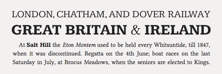
Sample of fonts used on Bradshaw’s Guide.
With content made up of English and European characters, punctuation marks, manacles, numerals and fractions, Libertine Regular needed to contain a large number of glyphs, including those needed for OpenType feature adaptions (ligatures, small caps, old style numerals etc.). Libertine Italic and Kameron Bold are used less often, so fewer characters were required. With the regular weight of Kameron used for uppercase headings, this was subset to include only uppercase letters, numbers and a few basic punctuation marks.
Unfortunately, few tools allowed me to subset fonts with this degree of precision. FontShop has a useful subsetting tool, but this only works with their own fonts. Font Squirrel’s web font generator can be useful, but strips out any OpenType features.
In the end, I had to install Fontforge, an unwieldy and complex font editor. This allowed me to reduce the number of characters in Linux Libertine from ~3000 to ~250, yet maintain (and edit) its many OpenType instructions.
With performance an important aspect of web design, it’s disappointing that web typography requires the download of large files that contain characters that may never be used.
Beyond dynamic subsetting (a technology which appears reserved for Monotype’s customers only) we need tools that help us subset fonts on a more granular basis. I’m envisaging a cross between Google Fonts (which indicates the overall download size of selected fonts), FontSquirrel’s web font generator, and FontForge, with its glyph view and editable OpenType instructions.
Internet, make it happen.