When it comes to web design it’s rare that all elements – functionality, clarity of information, and subjective beauty – come together to create a result that is widely admired, recognized or lauded in the same vein as anything resembling the likes of Saul Bass’ AT&T logo, or Susan Kare’s icons for the original Mac OS.
Writing in 2007, Armin Vit wondered which web sites could be considered landmarks of our profession. In drawing comparisons with celebrated graphic art, he cited the work of Milton Glaser, Paul Rand and Massimo Vignelli. Had further examples been given, I’m sure Otl Aicher’s iconic identity for the Olympic Games of Munich 1972 would have been included too.
Since the first games were held in 1896, the Olympics have proven a showcase for the greatest creative endeavours, of which Aicher’s work forms a small part. Be it Masaru Katsumi and Yusaku Kamekura’s pictograms for Tokyo 1964, Lance Wyman’s mesmerising identity for Mexico 1968 or Roger Taillibert’s daring – if not flawed – design for Montreal’s Olympic Stadium (still unfinished as those games commenced in 1976), artists and designers have left their indelible mark on the games. Yet still we wait for a web designer to contribute something of comparable value.
Many Logos, One Symbol
It’s too early to know what London 2012 will add to this rich history, but surely Heatherwick Studio’s magnificent Olympic cauldron, Zaha Hadid’s sleek Aquatic Centre and the distinctive pink way-finding signage are worthy candidates. As to the logo, while controversial, its impact has already been felt. Shortly after it was unveiled, I wrote:
[The London 2012 logo] immediately changes the rules of what constitutes an identity for an Olympic Games, and perhaps wider expectations of what a logo should look like too. We can safely assume that the logos for future games and candidate cities will be a lot less conservative.
I believe that has proven to be the case. The logo for Sochi 2014 was clearly influenced by that of London 2012, and although Rio 2016 reverts to a more traditional design, PyeongChang 2018’s is just as original as London’s:
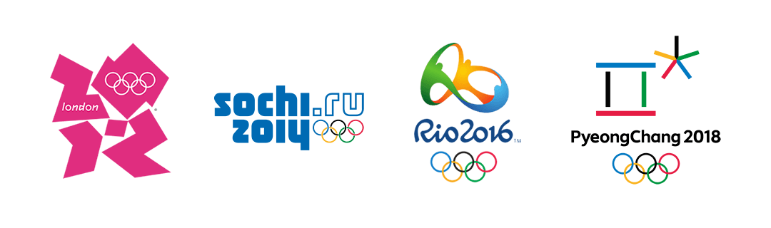
Logos for the London 2012, Sochi 2014, Rio 2016 and PyeongChang 2018 Olympic Games
While much publicity is poured over these logos and emblems, they play a supporting role to that of the five interlocking rings; Pierre de Coubertin’s ingenious symbol is still going strong 102 years later. In fact, it almost doesn’t matter what logo an organising committee chooses as it’ll often be reduced down to a horizontal wordmark anyway:
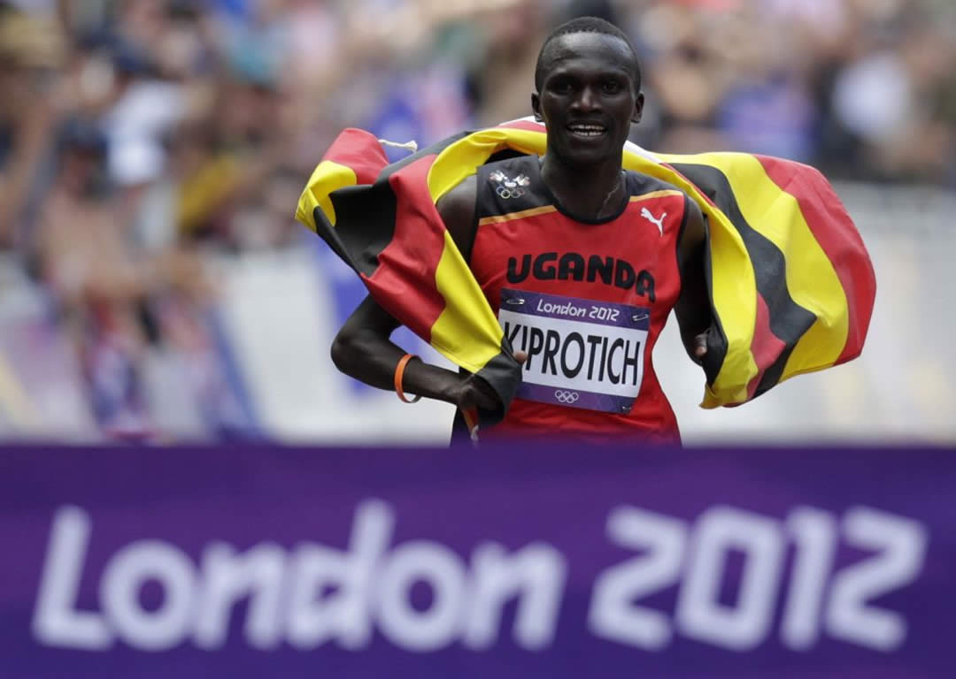
Uganda’s Stephen Kiprotich crosses the finish line to win the men’s marathon in the London 2012 Olympic Games. The wordmark features but the logo for those Games does not.
In that respect, Sochi’s stark typographic mark makes a lot of sense. Featuring no culturally symbolic motifs, ‘the first digital Games emblem in�Olympic history’ is signified by the inclusion of the .ru top level domain. According to the press release:
It�is�a�21st Century brand for a�digital generation. It�reflects how the Sochi 2014 Winter Games will be�accessed through�PC screens, PDAs and mobile phones and television, thanks to�ever-improving internet reach, bandwidth and the adoption of�new technologies. It�means that anyone can access the Olympic and Paralympic Winter Games, any time; any place; any way.
This press release is no longer available, probably because the website has failed to deliver on that multi-platform promise.
Digital Olympics of a Decade Ago
Ignoring the fact that sochi2014.ru redirects to a canonical domain of sochi2014.com, it’s hard to believe that in 2014, a website with such international reach, financial backing and development timescale is not responsive, particularly given the rationale around the logo.
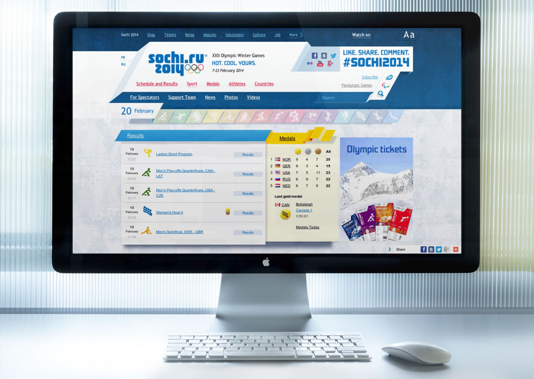
Website of the Sochi 2014 XXII Olympic Winter Games
The design of the site is no better, baring little relationship to the brand identity of these games. Instead, the site features isometric banners and inconsistent shadows reminiscent of a style prevalent fifteen years ago. Page layouts are crowded, with small text rendered in both Arial and Trebuchet, the brand font relegated to use on promotional images. To use this site – if you can find your way around the four different navigation menus – is to imagine the last ten years in web design didn’t happen.
If this complaint sounds familiar, it’s because I raised similar concerns two years ago:
Apologetic, safe and secretly hoping nobody notices that it’s been redesigned. Take away the logo, and this could be the website for any large corporation – probably one doing business ten years ago.
In critiquing the websites for London 2012 and Sochi 2014 I could be describing any contemporary website relating to the Olympic Games. Be it that for the youth games in Nanjig later this year, the summer games in Rio 2016, or the next Winter Olympics in PyeongChang – even the IOC’s own site – all are equally deficient in their own way.
Whereas the world’s foremost architects, graphic artists, typographers, iconographers and illustrators are asked to create their best work to celebrate each games, it seems the design and development of an Olympic website ends up being treated like an IT project, one likely carved up between the IOC’s commercial partners and sub-contracted to the highest bidder.
Surely a desire to produce modern, great looking websites must exist somewhere within the Olympic movement? Those hoping to host future games clearly understand the importance of good design on the web. None more so than the city of Oslo, which announced its intention to bid for the 2022 winter games by launching the stunning ol22.no:
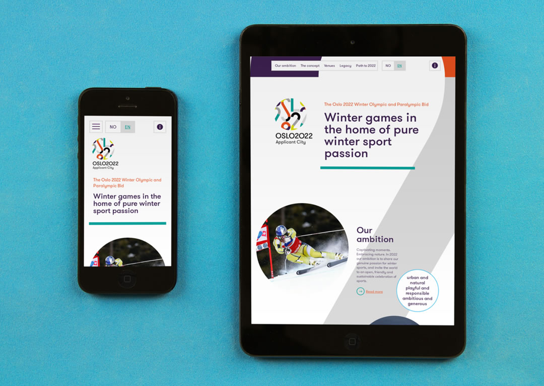
Website for Oslo 2022, applicant to host the Winter Games of 2022
Although at this stage the website has a different and more tightly scoped purpose than if it were supporting an Olympic Games, it is beautifully designed and thoughtfully laid out. Should Oslo earn the right to host the 2022 games, it seems unthinkable the accompanying website wouldn’t share those same qualities. Will it?