Each month net Magazine run a section called Exchange, where four industry experts each answer three questions on a particular topic, asked by their readers and followers on Twitter. I was asked to be the responsive expert in their March issue, which is on sale now.
In the spirit of previous articles, I’m sharing my unedited answers here as well.
What is your recommended method of handling dropdown menus when viewed on tablet and smartphone devices?
What are the best ways or resources out there you can use to convert a desktop menu into a mobile one?
Before thinking about a menu’s presentation or behaviour, first ensure the items it contains are relevant to users, whatever the breakpoint. Thinking mobile-first (rather than trying to adapt desktop design patterns downwards) can help prioritise and rationalise menu items, too.
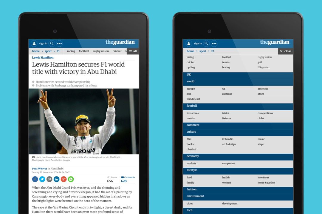
The Guardian’s navigation is a good example. It’s intriguing design prioritises page breadcrumbs at smaller screen widths, with horizontal scrolling allowing you to access sibling and top-level section items. An ‘all’ link provides a safety-net, giving you access to every section with one tap, starting with the section you are in.
A great resource for responsive patterns (including those dealing with navigation) is Brad Frost’s This is Responsive, but new possibilities are being uncovered every day.
I deal a lot with dashboards and still can’t find a good way of handling tables… please help!
As no two tables are the same, there’s no definitive solution. Simpler tables could be presented as a list at smaller breakpoints, while more complex tables may require a change of orientation so that column headers appear fixed on the left, with data in a scrollable area to the right. Or maybe you allow users to choose which columns to hide/show. Jason Grimsby has a good summary of the options available – and what you should consider before choosing one.
How do you deal with fixed width banner ads in a responsive site?
Display advertising means buggy code, belligerent design and dealing with an industry whose ingrained practice ignores real world needs, so any solution will be hacky. Placing an advert on a page usually involves picking a static IAB unit that best fits the current breakpoint before injecting it into the page. There are glimmers of hope. Google is working with publishers on tools that will allow agencies to create responsive, template-driven creatives, while other publishers have started creating responsive adverts for their partners in-house.