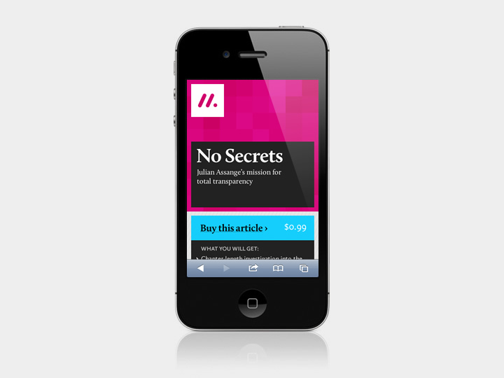
Matter is the brainchild of journalists Bobbie Johnson and Jim Giles. Frustrated with the lack of care and quality on display in most online journalism, they set out to create a service where journalists and readers could focus on the finest science and technology writing. To achieve this, they started a Kickstarter campaign which was enormously successful, proving that there was a real desire for high-quality, focused, long-form writing.
A incredibly collaborative project, I took the reins on the visual design and identity, with Jeremy Keith working on the front-end and Phil Gyford handling the Django-based back-end.
We began our work together with some design workshops where we did some competitor analysis, figured out the focus of the project, mapped user journeys, and hammered out design principles to guide us through the project.
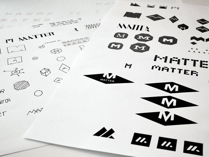
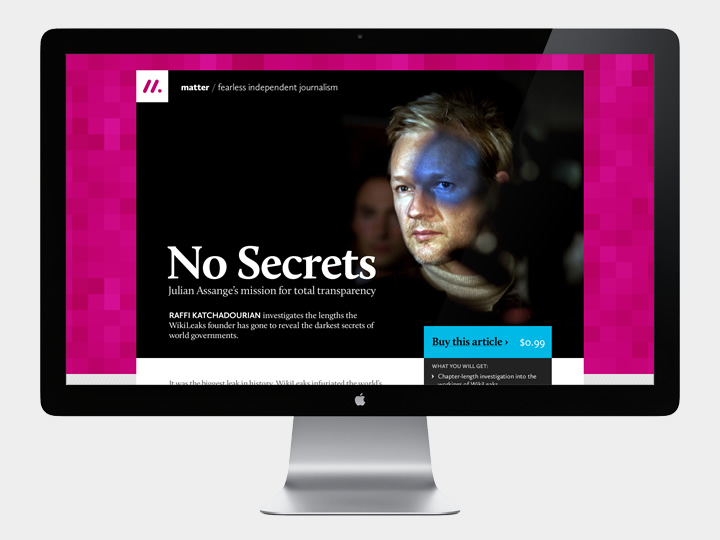
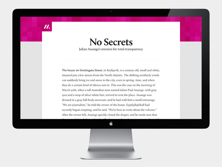
My early design work for Matter focused on its identity, thinking about how articles may appear on the web and how readers would recognise them in eBook stores and bookmark them on smartphone home screens. As the identity would play a supporting role to the articles being published, the logo needed to act as a hallmark, identifying an article as one that meets the high standards of journalism Matter is aiming for.
