Computer Revolution
The success of the Channel Four identity, caused immediate resentment from the various ITV companies, which considered the new channel to be its poor relation, yet its identity had become a talking point amongst the industry and public. They concluded that it was successful due to the fact that it was computer animated, and so ordered its graphic designers to computerise their logos.
The viewer was suddenly confronted with an array of computerised flying logos – Thames for example took its familiar London skyline image and turned it into a metallic looking slab that flew around the screen. Of course this had no effect on viewing figures or the popularity of the channels, as the identities bore no relationship to the values of the channels (if anything it made them all look the same). It was just fascination with a technique.
However the computer revolution started well before the launch of Channel Four, in fact it stemmed right back to the 1960’s and television news which became the spur for investment in this new technology.
News became design conscious with the introduction of ITN in September 1955. Before then, news on the BBC consisted of newsreels with a voiced-over news commentary. ITN was a refreshing alternative. By following the lead set in America, were news ‘anchormen’ were used to link news stories together in a studio environment, ITN’s style was soon adopted by the BBC. Since then, news has probably been the most competitive area of programming, and this has been matched by competitiveness in graphical approaches, with studio sets and informational graphics constantly being reassessed.
ITN led the way in 1959, with the introduction of the ‘Swingometer’ and introducing computers in the 1964 elections (although only to analyse data). It wasn’t until 1974, that ITN introduced the computer to present the information on screen. Using a VT30, it was the first time raster graphics were seen on British Television. Although the images produced were similar to those used on Teletext, it had the advantage of being able to be played back quickly ideal when large amounts of data are being presented continuously.
Engineers at ITN, later designed their own system, the VT80 which helped to greatly improve the appearance of the on-screen graphics during the 1980 American elections. It was these advances that made the BBC realise how far behind it was in its use of computer technology. The need for this increased investment was made more apparent with the soon to be launched early morning service Breakfast Time in January 1982 (a result of the expansion of television broadcasting laws – ITV launched its own service, TVam in the February of that year). It was only then that the BBC employed a further 20 designers and invested in the much needed computer hardware and software.
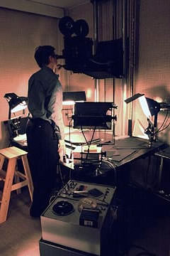
Figure 14
A film rostrum camera. Computer controlled rostrum cameras were introduced around the late 1970’s.
The computers use throughout the rest of television graphics has followed a path of ever-increased usage – from its control of the rostrum camera, to being able to generate images for on-screen. Before computers, the film rostrum camera was used in many areas of television graphics. The rostrum camera is a vertically mounted camera that is able move up and down above a bench on which the artwork is placed, and it is the bench that is able to produce the majority of the movement. Used mostly in the filming of animated title sequences, it was also used for the filming compilations of stills (be them photographs, paintings or prepared artwork) and shooting cells or drawings a frame at a time ready for animation.
In 1958, the BBC adapted the film rostrum camera so that it was able to record straight to video instead of film. This allowed the results to be instantly available and ended the wait for film to be processed. Computers first became involved when they were used to control the rostrum camera. By attaching motors to all its moving parts, allowed complicated moves and techniques such as ‘slit-scan’ and ‘streak-timing’ to be achieved. Next came digital paint systems such as the Quantel Paintbox, which enabled graphic designers to assemble collages and montages and also adapt images using an electronic pen and graphics tablet. Animation also became computerised allowing effects such as those in the Channel Four animations mentioned earlier.
As for lettering this became easier and less time consuming than the original hand drawn methods, first of with the Masseeley hot press printing machine in 1955, and then with ‘Letraset’ four years later, before character generators began to take over in 1969. Television graphics have reached a point now in which the vast majority in all aspects of graphic design is created on computer, and is becoming increasingly more integrated.

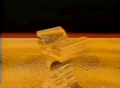
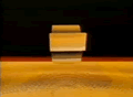
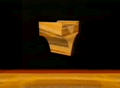
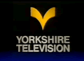
Figure 15
Yorkshire Television ident Liquid Gold (Yorkshire Television 1986. Designed by Jeff Parr)
However it was the eighties in which the computers use was more obvious to the viewer due to the fact that it had reached a stage in which it could be successfully used to create title-sequences or station indents and present graphical information. Green monitor output and wireframe graphics were fashionable at the start of the decade for use in station or programme promotions. As the technology improved, and greater effects could be achieved, so the fashion changed, meaning that during the mid to late eighties 3D animated computer graphics (usually with metallic or chrome rendering) were more commonly used.
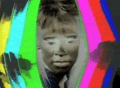
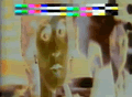
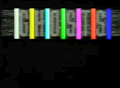
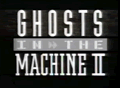
Figure 16
Title sequence from Ghosts in the Machine II (Channel Four 1988. Designed by Richard Markell)
As for programme titles, they all seemed to embrace colour in a way that was not seen during the previous decade with the influence from Channel Four’s identity on graphic designers particularly evident at this time. Using a similar palette to that of new channels identity, designers and often mixed photographs with illustrations which were usually very stylistic and sometimes of a cartoon nature. It also saw a return of the familiar black background in titles – last seen in the fifties – and on most occasions, titles ended with a simple title on black.