Growth & Evolution
The 22nd of September 1955 at 7:15pm saw the launch of Independent ‘commercial’ Television (ITV) in Britain, destroying the BBC’s 20-year-old monopoly in television. Initially, as with the BBC’s first broadcasts, Independent Television was limited to the London area for which the Independent Television Authority (ITA) awarding its first franchise to Associated Rediffusion Ltd.
The launch of ITV meant everything had to start from scratch with much of the expertise poached from the BBC. However this couldn’t happen with graphic design, as there was no precedent to follow – it was only shortly after the employment of John Sewell at the BBC, that the first Head of Design at Rediffusion employed their first graphic designers.
The model for resolving the graphic design needs of Independent Television was one in which the basic requirements were met. Most producers working for Rediffusion came from either the BBC, the film industry, or America and this meant there was very little sympathy for graphic design other than its most basic use. A result was a general lack of resources, limiting the scope of the work produced by the five designers.
Not only were they working in a medium that was new to them, but they were also in the position were quantity not quality was wanted from them. The same was true for the other independent stations that were rapidly being launched across the country: ATV (which provided programmes for the Midlands during weekdays and London at weekends), Granada (North weekdays), and ABC (Midlands and North at weekends).
The ITA envisaged a system of major and minor companies, similar to the Hollywood studio system, with the first four contracts being awarded to the ‘majors’ mentioned above. They would provide the majority of programmes for the network with the ‘minors’ behaving more like relay stations, producing the odd local programme and news for their region. In fact a large number of the minor television companies provided a real contribution to the national network. The minors were awarded their franchises between 1957 and 1962 when network was completed, providing the vast majority of the country with Independent Television. This strong regional output that it provided, persuaded the BBC to expand its number of regional television centers, and saw graphic design units set-up in Manchester, Bristol and Birmingham.
In 1962 the Wilkinson Committee which was assembled to assess the progress of both BBC and ITV and to make recommendations as to which should take responsibility for a third channel, published its report. A major criticism was the lack of investment in areas that weren’t directly associated with revenue return, and this included graphic design. However the subsequent reorganisation of the Independent Television network in 1968, with some franchises being awarded to new companies, still saw a policy of minimal investment in graphic design.
Meanwhile at the BBC, things were looking very different. It had won the right to broadcast the new channel, BBC2, which first aired on the 30th April 1964 and was also the date on which 625-line transmissions began. In 1967, the graphic design unit, with its new semi-independence from scenic design, was involved in advising the government on which system to adopt for colour television. This meant an extra amount of work for the graphic designers, monitoring and conducting tests, between PAL and CECAM. One such test involved filming a studio full of naked people to test the reproduction of flesh tints. Colour transmissions finally began on BBC2 on the 1st July 1967, with colour transmissions on BBC1 and ITV beginning in November 1969.
After its involvement, it became clear that the ‘experimental’ section had an important role to play in BBC Television’s output. It was soon decided that the section should become a separate department, with the freedom to manage its own budgets and briefs, and a Head of Graphic Design was appointed. The department faced yet further expansion in 1970, when the BBC’s Open University programming began, with a whole new unit set up to deal with its graphic needs. It was here that experiments with character generators began.
Typical graphic design during the sixties saw a move to a greater use of photography and more detailed illustration, due mainly to the fact that 625-line transmissions when they were launched in 1964, allowed greater picture definition, allowing graphic designers more creativity. There was also a lot more innovation with the increasing knowledge of the effects a film rostrum camera could achieve. The greater use of calligraphy was apparent at this time too.

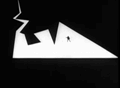
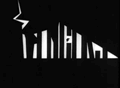
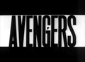
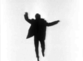
Figure 5
Title sequence from The Avengers (ABC 1963. Designed by Jerome Gask). Watch on YouTube
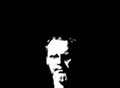
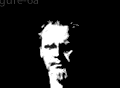
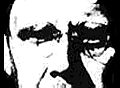
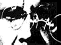
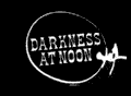
Figure 6
Title sequence from Darkness at Noon (Associated Rediffusion 1964. Designed by Arnold Schwartzman)
The introduction, firstly of 625-line broadcasts and later colour, had obvious benefits to designers although in a way they were also a hindrance. It has to be remembered that even though these improvements were available, they were being broadcast alongside the old 405-line transmissions (which even with their quality weren’t suspended until early 1985). It was up to the audience to upgrade their sets and sales of colour receivers were unexpectedly low when colour television broadcasts began. Before the majority of viewers had 625-line and colour receivers, the designer still had to consider those watching on 405-lines and monochrome sets.
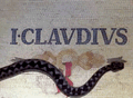
Figure 7
Title sequence from I, Claudius (BBC 1976. Designed by Richard Bailey). Watch on YouTube
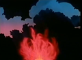
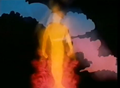


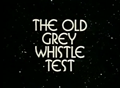
Figure 8
Title sequence from The Old Grey Whistle Test (BBC 1968. Designed by Roger Ferrin). Watch on YouTube
These considerations were particularly true of the seventies, especially the early years. Colour wasn’t truly advantageous to the graphic designer as, although it allowed greater creativity, it had the major disadvantage in that mistakes were harder to conceal. Before colour and 625-lines, due to the quality of the medium, a lot of graphic designers managed to get things broadcast that wouldn’t be now with the mediums picture improvements. This meant graphic design wasn’t as straight forward, and designers had to think much more about what they were producing and pay much more attention to detail.