Pioneers
The history of graphic design in television has been relatively short yet it has seen so many changes that everyone in the profession can feel they are ‘pioneers’. However, there are two people that stand out from the rest; Bernard Lodge and Martin Lambie-Nairn, both of whom regard Saul Bass as a major influence on their work.
Bernard Lodge
After leaving the Royal College of Art, Bernard Lodge joined the BBC in 1959. It was here that he got the opportunity to design the title sequence for a new children’s series Doctor Who in 1963. By exploiting the effect that occurs when a television camera is pointed towards a monitor, he was able to convey the idea of time travel and space fiction and created what became the famous title sequence. When he reworked the sequence in 1973, he again used techniques that were new to the profession, by using a computer controlled rostrum camera. Lodge produced many more memorable title sequences before leaving the BBC in 1977 to form his own company which later became Lodge-Cheeseman when his former colleague, Colin Cheesman (who had become Head of Graphic Design at the BBC), joined him.
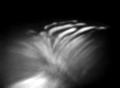
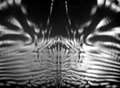
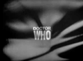
Figure 9
Title sequence from Doctor Who (BBC 1963. Designed by Bernard Lodge). Watch on YouTube
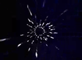
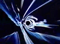
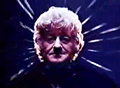
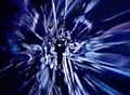
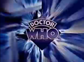
Figure 10
Title sequence from Doctor Who (BBC 1973. Designed by Bernard Lodge). Watch on YouTube
Both Lodge and Cheesman were working at a time when the use of computers in the profession were being used to an ever greater extent, but both believed that the computer should be used not as an end to itself, but as a key to open new creative doors
. (Merritt 1987: 10) Bernard Lodge enabled more doors to be opened by working with Filmflex Ltd. to develop new animation techniques with the computer controlled rostrum camera. These included ‘streak-timing’ to produce a drawn and blurred light effect and ‘slit-scan’, which could be used to create controlled distortions. Lodge-Cheeseman went on to produce work for television commercials and also graphic effects for the movies Alien and Bladerunner.
Martin Lambie-Nairn
After leaving Canterbury College of Art in 1965, Martin Lambie-Nairn applied to the BBC for its holiday relief scheme in which students were taken on for three-month contracts over the summer. He was accepted and given the job of assisting Alan Jeapes. After the three months, Lambie-Nairn was made Jeapes full-time assistant, making him the youngest assistant graphic designer in BBC television at the age of only nineteen.
In 1967, he left the BBC to join Associated Rediffusion however, when Rediffusion lost its franchise to London Weekend Television (LWT), Lambie-Nairn decided to go it alone, and set up his own company to handle the freelance work he was acquiring. This proved to be a mistake and after a brief time at the Conran Design Group, he decided television was his home and moved to Independent Television News (ITN) were he became deputy to the senior designer.
Here he worked on the on-screen graphics for the Apollo space missions including the near-disastrous Apollo 13 mission. An opportunity came up in 1970 with an open-brief for the design of a new company logo and title sequence for ITN’s flagship programme News at Ten. However, the senior designer, Malcolm Beatson, had cornered the brief, but Lambie-Nairn had been asked to have ago at the brief himself by ITN’s Editor in Chief. When his ideas were chosen over Beatson’s, he was seen to be undermining him and resulted with the whole design department refusing to speak to him for a while. It was because of this, that he left ITN and joined LWT.
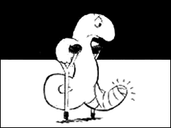
Figure 11
Typical still used up until the late 1970’s to illustrate current affairs or news items. If the item were to complicated to convey in a single still, it would be animated.
It was here that Martin Lambie-Nairn was to find his big break. Weekend World was LWT’s current affairs programme, was broadcast on Sunday lunchtimes and due to its topicality, required a graphic designer to work from midday Saturday to midday Sunday. As it was such an antisocial shift, the contract to produce its graphics was placed outside of LWT. At this time Lambie-Nairn had set up his own company with a fellow colleague Colin Robinson, and the contract presented a golden opportunity for Robinson Lambie-Nairn. They won the contract, and it was here that Lambie-Nairn revolutionised the graphic conventions used in presenting current-affairs related information graphically.
This was traditionally based on newspaper cartoons – for example, if there was a story about the pound being weak, a cartoon drawing of a pound sign wearing bandages and using crutches was shown. Realising that this was at odds with communicating a serious news item, Lambie-Nairn developed a new method of presenting this sort of information in a more appropriate graphical manner. It was with this new approach that Weekend World became more successful, and this meant more work for Robinson Lambie-Nairn who found themselves leaders in a field of one
(Lambie-Nairn, 1997).
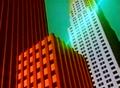
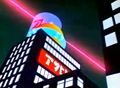
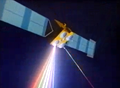
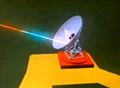

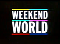
Figure 12
Title sequence from Weekend World (LWT 1982. Creative Director/Designer: Martin Lambie-Nairn). Watch on YouTube
It was with the launch of Channel Four though were Martin Lambie-Nairn was to create waves in the television industry. Taking the idea that this new channel didn’t make its own programmes, but commissioned them from independent programme makers, Lambie-Nairn designed the innovative ‘coloured building blocks’ that came together to form the channel’s figure 4 logo. This had to be produced in the United States, whose computer animation technology was far more advanced than in Britain. Lambie-Nairn also introduced many new concepts that were new in 1982, but common place in television nowadays.
He created a series of animations that were all based on the coming together of the ‘coloured building blocks’ but all were slightly different, helping to keep the stations identity fresh and new. One such animation showed the coloured blocks separate and revolve – almost coming out of the screen – before returning to its original figure four, whilst another saw blocks fly in towards the centre of the screen to form the four. Although this was expensive to implement it was radically different to its competitors which at that time, all which had a single on-screen indent they returned to, be it BBC1’s globe, Anglia’s revolving silver knight or Thames’ London skyline.
Channel Four also had consistent on-screen branding, with programme menus, weather charts, on-screen promotions etc. all having the same look and feel often with the Channel Four logo used like a postage stamp in the top right hand corner of the screen. However prior to launch, it wasn’t liked by some of the channels executives, one of which wanted the logo to be rendered with a chrome effect and have the appearance of a turned off television. This showed that graphic design in television still wasn’t fully understood even by 1982. The Channel’s identity was so far ahead of its time, that it remained largely unchanged for 14 years, unheard of in todays rapidly changing industry.


Figure 13
Channel Four ident Round and Back (Channel Four 1982. Creative Director/Designer: Martin Lambie-Nairn)
On the back of this success, Lambie-Nairn was asked to design many other corporate identities for television companies. These included Anglia, in which Lambie-Nairn was responsible for the removal of the then much loved, but out of date, revolving silver knight and the satellite company British Satellite Broadcasting (BSB). However all five channel identities he created were replaced after only a couple of months when the company ‘merged’ with Sky.
He also became successful outside of Britain, working with companies such as TF1 (France), ARTE (France and Germany), EuroSport (Europe), TV Norge (Norway) and Quatro (Portugal) to name but a few.
It was with his old employers though, the BBC, that Lambie-Nairn became the most respected. In 1991, Lambie-Nairn was responsible for, as he saw it, ‘repositioning’ BBC1 and BBC2. This was especially true with BBC2 that beforehand, with the old ‘TWO’ indent, was seen as a channel that was middle-class and boring. By replacing it with the figure ‘2’ in a series of indents that echoed the different values of the channel, not only did the he succeed in making the channel more accessible, the indents almost became more popular than the channel itself.
It was for this reason that when Lambie-Nairn was recalled in 1997 to redesign the BBC’s identity, from its corporate logo to all of its radio and television station identities – that the BBC2 logo remained unchanged, with only more indents being added to the ever increasing family. Lambie-Nairn has gained so much credibility within the BBC, that nearly everything you see today on the BBC, has been created by Martin Lambie-Nairn.
His success has also reached a point, that for a long period during the 1990’s, three of the four terrestrial television channels, a number of ITV regions, and many satellite channels, all had identities created by Lambie-Nairn as well as a number of overseas television companies. Martin Lambie-Nairn was also the man behind the popular eighties satirical television show Spitting Image in which his company also financed the initial development.