Give Me 5
The general presentation and look of television remained largely unchanged until the arrival of Channel 5 – the UK’s fifth and final terrestrial television channel – created with the sole purpose of stimulating competition and increasing airtime available to advertisers.
A year earlier, and anticipating the new channels launch, Channel 4, still using its original idents decided to assess its on-screen image and came up with ‘Connections’, a new identity produced in-house, but with early input from Tomato.
This new identity consisted of four circles presented in various static formations or in motion linked by lines, representing the channel (shown by a circle containing the retained stenciled 4 figure from 1982), its programmes, its viewers and society at large. A large part of the channels identity rested with its programmes with many idents featuring the channels celebrities speaking straight to camera “You’re watching Channel Four” before going out of focus and overlaid with the four circles. Other idents and break bumpers saw the circles overlaid blurred images of urban locations such as streets and airports, and featured people about their daily business.
The circles theme extended to programme captions, where again one circle contained the four logo; one contained an analogue clock showing start time, and two further circles of varying size contained programme related imagery. All titles were set in a sans serif typeface, with larger programme titles bolder and italicised, although the placement of all these elements was quite random. However for a channel once vibrant and full of movement, it was now drained of its multiple colours and also became a little static.
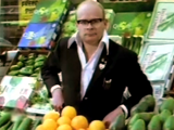
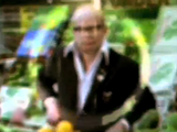

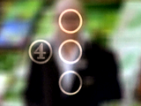
Figure 13
Channel 4’s ‘Connections’ identity. This particular example featured the comedian Harry Hill from ‘The Harry Hill Show’ – a popular show on the channel at the time.


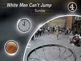
Figure 14
The ‘Connections’ theme was extended across all on-screen promotion.
Channel 5 eventually launched on Easter Sunday 1997, but prior to this, the channel was responsible for retuning television sets in 9 million homes to avoid interference with video recorders. Not only did the channel need to inform the public about its arrival, but also about the need to get their video equipment retuned. As an unknown entity, Channel 5 had to quickly build awareness of its name and brand, only a few months before the launch of the channel (and only 18 months before the launch of digital satellite).
The company responsible for building this awareness was Wollf Olins, the company responsible for BT and Orange corporate identities but this was their first venture into television. They devised an identity that worked in two parts. The first part involved the creation of a ‘retuning brand’ using the slogan “give me 5” and featured five vertical bands of vivid colour – blue, orange pink, yellow and green, and a logo which was a 5 inside two thin circles, taking design cues from that of test cards. This visual imagery was:
…deliberately bright and straight forward – it reflects the tone of the programming which will be optimistic and unashamedly populist
Davies, 1997
As it turned out, the success of the retuning campaign led to Channel 5 using the same identity on screen, with only a minor modification to the logo, simplifying it to one slightly thicker circle for better clarity on screen. However, Channel 5’s first selection of idents was a mixed bag and didn’t seem to match the vivid pre-launch campaign. Many consisted of manipulations of the 5 logo and the word five, as well as involving images of flowers, drops of water and clouds – somewhat American in flavour.
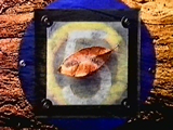
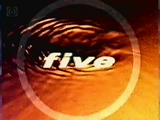
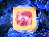

Figure 15
A sequence from one of the first idents for Channel 5.

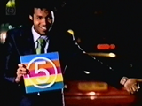
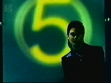
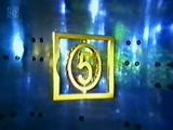
Figure 16
Four separate stills from other idents from the set.
As a sign of things to come, Channel 5 controversially launched with a DOG (Digital Onscreen Graphic) – the channels logo constantly displayed in the top left hand corner of the screen. A device heavily used on cable and satellite channels, this was new to terrestrial viewers and irritated them. It was decided to use such a device so that people could find the new channel, but only served to irritate them. However it still remains today, yet with a higher level of transparency than when first seen.
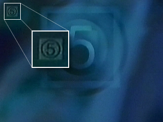
Figure 17
Channel 5 constantly displays its logo on screen.
The original set of idents lasted for two years before being replaced with arguably more appropriate idents that used the 5 logo and colours more consistently. Upon their launch Jim Hytner, Marketing Director at Channel 5 said:
The launch itself was successful in establishing it as a big brand or a big channel but I’m not sure that we the channel had a good enough feeling about what our programming was going to be, and therefore it was quite hard to express that to viewers.
McGonagle, 2002
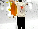

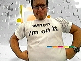

Figure 18
Later revisions of the channels identity were more consistent with its off-air brand.
The new idents involved channel personalities and celebrities taking the mickey out of the channel or themselves which tried to express a confidence to the viewer that the channel had about itself. These were updated again a year later but retained the same themes.