The Launch of Channel 4
The launch of Channel 4 in 1982 saw the first new television channel since BBC2, and heralded in a whole new era of television. Channel 4 was to be a channel aimed towards minority and neglected interests, would take risks and unlike the other channels at that time, was to commission programmes from independent programme makers – acting more like a publisher than a broadcaster.
It wasn’t only the channel that was to be new and original however. Its identity and presentation style devised by Robinson Lambie-Nairn, was to have a profound effect on graphic design in television throughout the eighties.
Taking into account that Channel 4 was to commission its programmes from independent programme makers, Robinson Lambie-Nairn devised a logo that reflected this, and in its on-screen implementation flying coloured blocks set against a black background came together to form a figure four in the centre of the screen. However, instead of just a single animation, four variations were produced that aimed to keep the channel fresh and surprising, and give it a unique personality that could be developed over time.
Although it was expensive to implement, it was radically different to its competitors, all of which returned to a single on-screen ident, be it BBC1’s revolving globe, Anglia’s revolving knight or Thames’ London skyline.
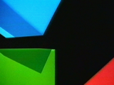
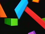
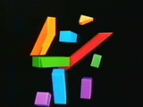
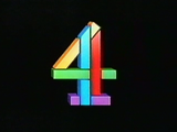
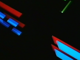
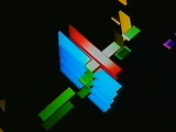
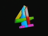
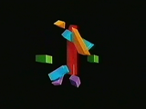

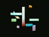
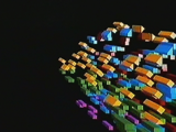
Figure 6
The four original launch idents for Channel 4
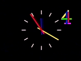
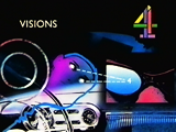
Figure 7
The idents were part of a consistent presentation style across the channel.
These idents were paired with a strong four-note signature tune composed by David Dundas that, like the figure four, could be adapted to suit a particular mood or theme. Compared to its rivals, Channel 4 used bright colour, movement, ground breaking technology and had a consistent image both on and off screen. In turn, Channel 4 became the first channel to have ‘a brand’, a visual property to hang on to – something very important to a channel that was going to find it hard competing against three well established channels and a lot of bad press initially.
The launch identity has since been lauded as the most innovative corporate solution of the eighties.
Mistry, 1996
Robinson Lambie-Nairn encouraged the channel’s presentation department to follow in the same lines as the programme makers and commission other artists to produce promotional pieces for them. This saw seasonal campaign sequences designed by the likes of Oscar Grillio, Blink and Terrance Donovan which by doing so, saw Channel 4 perceived as a centre of design innovation and excellence.
The success of the Channel 4 identity caused immediate resentment from various ITV regions, which considered the new channel to be its ‘poor relation’ (Lambie-Nairn, 1997, p85), yet it had an identity that was a talking point amongst both industry and public. They concluded that it was successful due to the fact that its idents were computer animated (apposed to its consistent and well applied design) and ordered their graphic designers to computerise their logos.
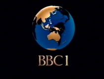
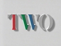
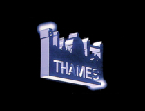
Figure 8
The face of television across all channels became increasingly similar. Here are shown idents for BBC1, BBC2 and Thames (an ITV region serving London during weekdays)
The viewer was suddenly confronted with an array of flying logos. Thames for example took its familiar London skyline image and turned it into a metallic looking slab and flew around the screen. Of course this had no effect on viewing figures or the popularity of the channels, as the identities bore no relationship to the values of the channels (if anything it made them all look the same). It was just a fascination with a technique.
The BBC for some part, also jumped on the computer generated bandwagon. In 1985, its famous globe became what it termed a COW (Computer Originated World) – a blue and gold revolving globe on a black background with ‘BBC 1’ in large gold letters beneath. Its second channel BBC2 used a stenciled serif TWO that rose out of a grey background, with three portions coloured red, green and blue – the primary colours used to produce colour imagery in television.