Updating the Brands: ITV
By the mid-ninetees every ITV region was back to using individual identities – with only Grampian using the original 1989 idents and graphics. At the same time, the ITV network was entering a period of consolidation and mergers amongst the franchises, threatening its regional identity.
A few years after Yorkshire and Tyne Tees Television merged, the Managing Director of the combined group, Bruce Gyngell, decided to place the two stations under a single ‘Channel 3’ umbrella brand. The board at Yorkshire Television weren’t keen about re-branding their station, but agreed to experiment with the idea at Tyne Tees, which was renamed Channel 3 North East. Its ident featured a large gold numeral ‘3’ from which the words North East emerged, and was put together by a design company in Leeds. It was nothing new or original, in fact it was pretty bland, and reportedly created in an afternoon. An extended ident was also produced, that sometimes featured before the local news, in which various landscapes from the region where intertwined with groups of three (three swimmers, three kids on swings etc.) as well as local personalities from the channel.
However this was as far as the brand went, and viewers were confronted with pretty much of what went before. It also caused confusion with continuity announcers often presenting the channel as Tyne Tees Television, broadcasting on Channel 3 in the North-East
or similar mouthfuls, matched with an ident including both Channel 3 North East, and Tyne Tees names. As a result it wasn’t well received by the public and only lasted a year. The Yorkshire version of the ident was more faithful to the original ‘Chevron’ identity, with the gold ‘3’ only seen at the beginning of its ident. When Yorkshire Tyne Tees was taken over by Granada, the Channel 3 brand was scraped and the Tyne Tees name reinstated.
Central was also another regional company to be taken over, this time by Carlton Communications, holder of the London weekday franchise, in 1994. In its first attempt at consistency across the two franchises in late 1996, both Central and Carlton in London used a set of idents designed to complement the networks programming. Here either the word CARLTON or CENTRAL (both visually similar) set in Gill Sans, morphed into rows of houses (Coronation Street), had their letters rearranged (for use before game shows), were spelt out with the phonetic alphabet (The Bill) or had footballs struck at them, and many other such treatments. Usually set in white against bright colours, this was based more on Carlton’s brand history than Central’s, but at least the Central name was retained.
However this only lasted two years, before the inevitable happened and all three regions now owned by the group were simply named Carlton, and used a new common identity. This contained Carlton’s logo that had originally been designed to warm viewers to the name when it took over the London weekday franchise in 1992, with the placement of the ‘T’ within the ‘L’ to hint at LON for London.
Yet again, the ITV network was divided and segregated. Almost ten years after English and Pockett designed its first identity, ITV now wanted an identity that better reflected the channels mass appeal and unique position in British TV as the channel closest to peoples heart
and one that moved away from a distant, corporate image to a more consumer friendly brand
(Futurebrand.com, 2002). English and Pockett was again the company responsible for this new image, and saw a new logo with yellow lowercase ITV initials set inside a blue rectangle. These colours were chosen to reflect the networks heritage and took colours predominating in the logos of most regional companies. A year later, its onscreen implementation was introduced, and again a dual branding system was devised for nine of the 14 regional companies. 16 different street level sequences were created showing activities of ordinary people in Britain – such as moving house, hanging out the washing, painting a floor – that revealed the heart motive at the end of the sequence.
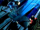
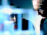
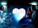
Figure 27
In this ident, a group of architects are seen working around a table, before the heat motif is revealed, followed by a regions name and logo.


Figure 28
16 heart sequences were created in total. Here four are shown – searching in woods, at a funfair, watering a football pitch and at a beach.
That is not to say that the hearts identity was universally appropriate, as was proven in the LWT region. With a long-standing reputation as the region for producing the majority of the networks weekend entertainment, and in London exclusively seen as an identity for the weekend, the hearts theme in its original format just didn’t fit. A more appropriate version was devised in which a camera panned across a video wall showing clips from the pervious hearts idents as well as LWT branding. The music was also changed to be far more upbeat.


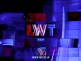
Figure 29
The heart sequences weren’t appropriate for the LWT region, where it was given a more livelier treatment.
Only nine of the 14 regions used these idents. Ulster Television (UTV) had by now developed a completely separate identity to that of ITV, and the Scottish regions (Scottish and Grampian) now both owned by Scottish Media Group (SMG) opted out and had a separate identity created involving a blue square and images of Scots of all ages in daily activities. Also, the three Carlton Communication owned regions (Central, Westcountry and Carlton) since renamed Carlton used an alternative – though still based on the hearts theme. The Lambie-Nairn produced idents indicated that Carlton was the star of the ITV network and was reflected on-screen with animations of various hearts that have a star in the corner before ending with a standardised Carlton title. In effect, ITV was now seemingly four different regions: UTV, and those owned by Carlton, Scottish and Granada media groups.


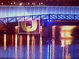
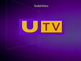
Figure 30
Carlton, Scottish and UTV regions didn’t use the hearts sequence, with the later two no longer referring to the ITV name either.
Whilst the BBC tried to reflect its public service image (bringing the world to every corner of Britain), it brought with it a recognition of the rest of Britain. Indeed, it was the first time that BBC1 had used such strong regional elements in its identity. ITV was also trying to display its credentials as not only Britain’s most popular channel, but as that closest to peoples hearts. But this was at a time when many regional names and identities were disappearing and as pointed out before these provided strong links with each regions viewers. It turned out that whilst the BBC was becoming more regionalised (a fact reflected in its programme scheduling and budgets), ITV was becoming more centralised, both on and off screen.