Updating the Brands: Channel 4
Channel 4’s logo now looked embarrassingly similar to that of Channel 5 – both having a numeral inside a circle (Channel 4’s logo was often simplified to using just the one circle).
As a new look to underline Channel 4’s position as a network that will remain relevant and innovative into the millennium
(Mistry, 1996), the connections identity proved to be too formulaic and constraining, especially off-air were the circles were no longer working in a meaningful way.
In 1999, a new image for the channel was created by consultancy Spin and the channel’s in-house team. This saw the return of colour and movement to the Channel 4 identity, and like the original, was designed to break a lot of television rules. Again, the original stenciled ‘4’ logo was retained but in this implementation it was reversed out of a white square which both on and off screen was placed right of centre.
The original set of idents featured straight vertical bands of colour – sometimes containing non-specific imagery such as roads, tunnels, swimming pools within these bands, which moved from left to right behind the logo. Again versions were created depicting the channel’s personalities, and this time involved showing their apparent habits as they watched the channel – Richard Whitely dunking biscuits into his tea, whilst on his bed watching 15 to 1 for example.
The idents proved extremely versatile with variations for children’s programming and its teenage stand T4 continuing the theme – slanting the bands slightly to the right and using bright and vibrant consistent colours such as blue, yellow and orange. All promotional material also maintained the square logo’s position as seen on screen.
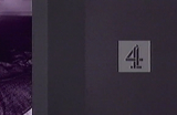
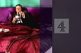
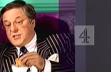
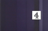
Figure 19
The use of celebrities within Channel 4’s new idents tried to foster an emotional link with their audience.
The first reworking of the idents, designed in-house and by Static 2358, played about more with the logo, moving it horizontally across the screen whilst flipping it about, spinning it around, blurring or distorting it before returning it to its standard position – reminiscent of the launch idents of 1982.
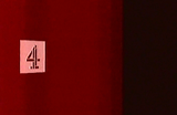
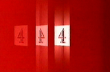
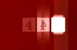
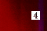
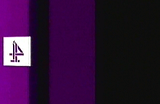
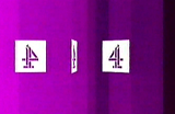
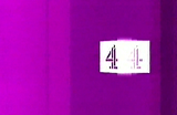
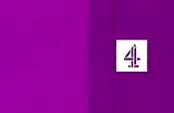
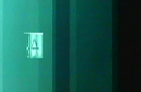
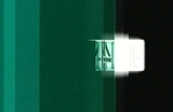
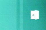
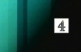
Figure 20
Later revisions of the channels identity involved more movement of the logo.
New captions for programme start times were introduced, where four squares were centred on screen, the first three containing an image relating to the programme, whilst the last contained the 4 in its square. It was also around this time that idents for use during daytime were introduced, and saw the square coloured to complement its background (an orange square on blue, and red on green).
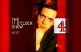
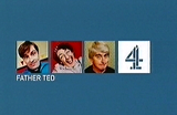
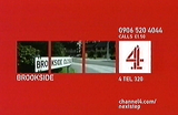
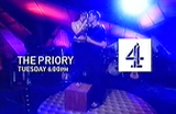
Figure 21
All presentation carried the logo in the same position on screen.
The latest update saw some narrative elements added, with the vertical lines being created by vapour trails, the movement of water, the beating of a heart, coloured lights and sound waves. Again the logo became more involved within the ident, and whilst still remaining in the same position on screen, it mimicked the action taking place behind it.

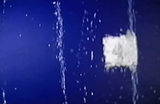
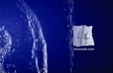
Figure 22
In this ident, the vertical lines are created by water ripples, and so the logo ripples also.
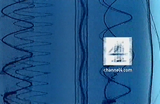
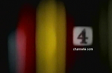
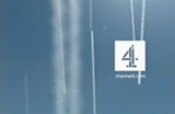
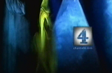
Figure 23
The latest update to Channel 4’s on screen image shows the versatility of the original ‘lines’ concept.
In retrospect, Channel 4 made a mistake in some ways with its over eagerness to compete with Channel 5, a channel that had a very populist output at odds with Channel 4’s. It was admitted later that the connections identity was rushed out ahead of the Channel 5 launch, and by the end of the decade returned to an identity close to that of 1982 with a strong involvement of colour and movement.
Although the connections identity was well put together, it wasn’t that innovative, but its replacement was completely different to anything else seen on television. For its part, Channel 5’s original on-screen identity was one that didn’t fit the channel’s personality, or its off screen identity – and it wasn’t until two years later that a more appropriate one was aired.