Updating the Brands: BBC
With no corporate guidelines, the BBC had ‘zillions of logos’ and was generating new ones at a rate of two a week. With the advent of digital and the launch of more channels and services, its brand was being increasingly weakened.
In 1997, the BBC’s corporate identity across all divisions was updated, with the previous slanted underlined logo designed in 1986 far simplified. According to Lambie-Nairn, who was selected to oversee the branding of the corporation, the existing logo was dated, expensive to print and didn’t work on screen. Whilst the new logo still contained the initials BBC inside three boxes, they were now settled on their upright with the type set in Gill Sans. Lambie-Nairn described the new logo as robust and elegant and solving all the technical problems in one hit
(Gilgrist, 1997). With guidelines that dictated that a channel, directorate, regional and other names should run to the right of the logo and also be set in Gill Sans, meant it all looked like it came from the same organisation.
It followed that with a new corporate identity, most elements of the corporation would have to be redesigned or altered to work alongside it. On television, BBC2 kept the popular 2’s and although some idents were discontinued, for those that remained only the 2 was slightly enlarged and new BBC logo and channel name added, with further idents added to the collection over the following years.
BBC1 retained the globe, however it was given a new twist by using an orange air balloon styled as a globe, and floating it above different landmarks and regions across Britain, Lambie-Nairn again aiming to reposition the channel. The use of bright orange for the balloon was in strong contrast to the earthy browns, greens and yellows as well as the blues within the sky.
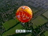
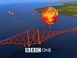
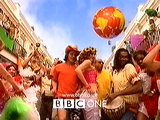
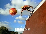
Figure 24
BBC1’s image was given a new twist with an identity featuring an orange balloon flown over Britain. Later additions to the ident set showed images of people skateboarding, bungee jumping, in carnivals and at a market.
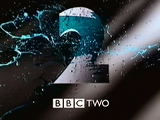
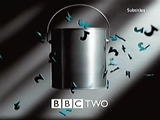
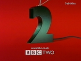
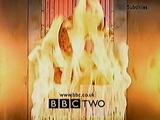
Figure 25
BBC2’s idents were left pretty much untouched. A new addition to the collection at this time showed the strength of the identity. This featured a simple paint-pot that mimicked one of the first idents Paint. However with more and more idents being added to the collection – some no longer featuring the viridian colour – such as Kebab shown above, the brand was becoming increasingly weakened.
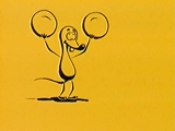
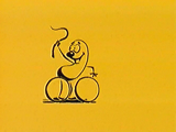
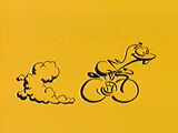
Figure 26
All of the BBC’s children’s output was given a new look, using just the colours yellow and black and a distinct use of simple animation.
Both channels kept the consistency seen in the last makeover, but this time all onscreen promotional material carried ‘BBC ONE’ or ‘BBC TWO’ centred at the bottom of the screen – this placement more suitable for the upcoming widescreen format used in digital television.